
Shelly · 2025
Wellness app for people who hate wellness apps
Building health routines through flexibility, not pressure. Redrawn and set in motion, 2026.
In short
Most wellness apps punish you the moment you slip. Streaks turn care into guilt.
An anti-guilt habit builder, usability tested: every participant completed the core flow.
- MVP design sprint
- 4 weeks
- Research participants
- 16
- Happy-path screens, zero confusion in testing
- 26
Your streak broke. Right on cue, the guilt kicks in. Shelly is a routine-building app that refuses to work that way.
The client, the Daily Health Conference, is a non-profit promoting wellness since 1983. The expertise is real; the technology lagged, and memberships dropped with it. They needed a modern offer that keeps their community, in a crowded health-tech space, strictly inside GDPR.
The research
The research
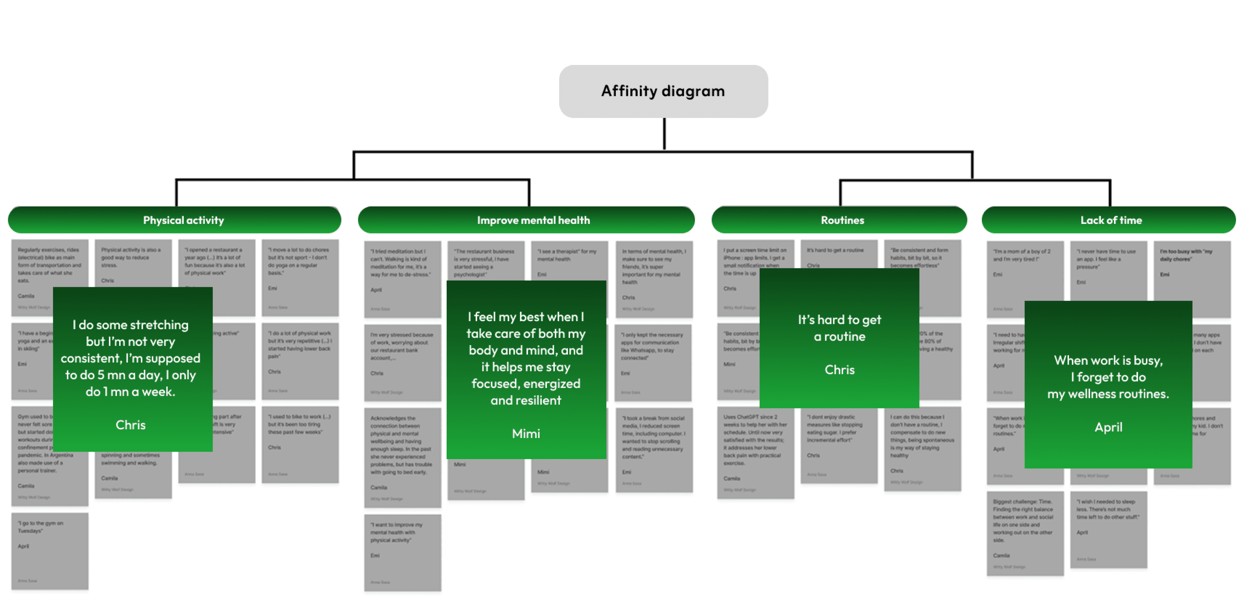
For Shelly, city life leaves no room for rigid wellness plans. Research with 16 participants showed the conflict:
Existing apps punish the slip: miss a streak and the app judges you, so people leave. And a majority prioritise mental wellbeing over physical metrics. The answer took its cue from the tortoise and the hare: slow, steady, flexible habits. Hence the hare racing through the screens.
The original prototype
The original prototype
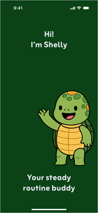
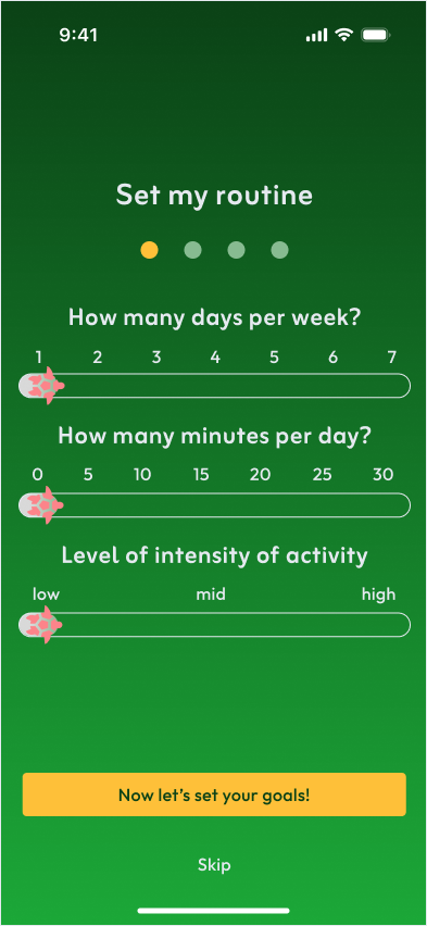
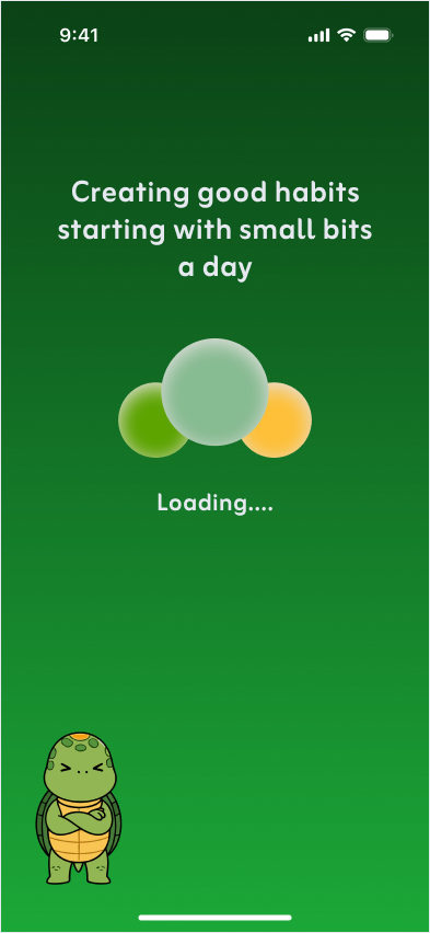
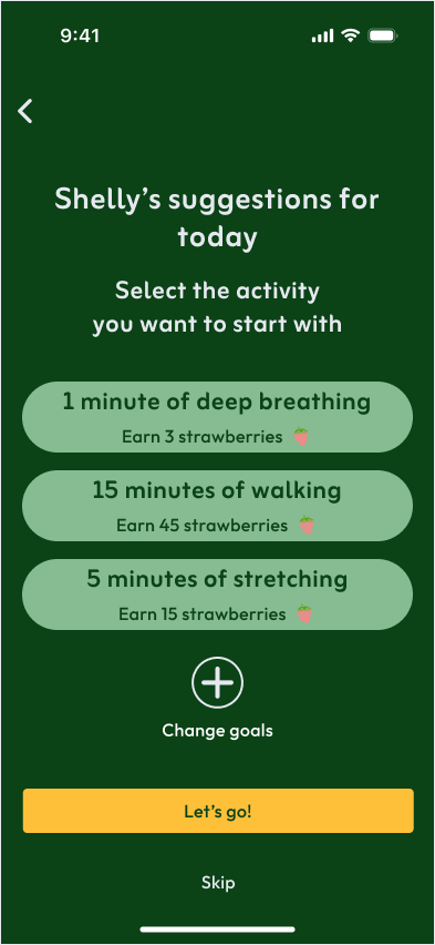
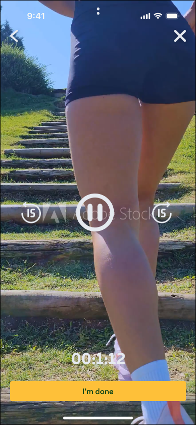
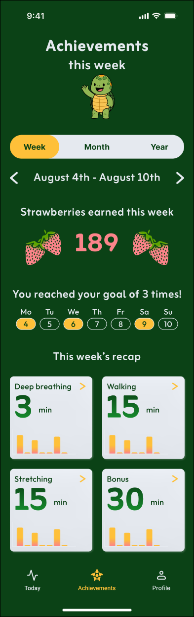
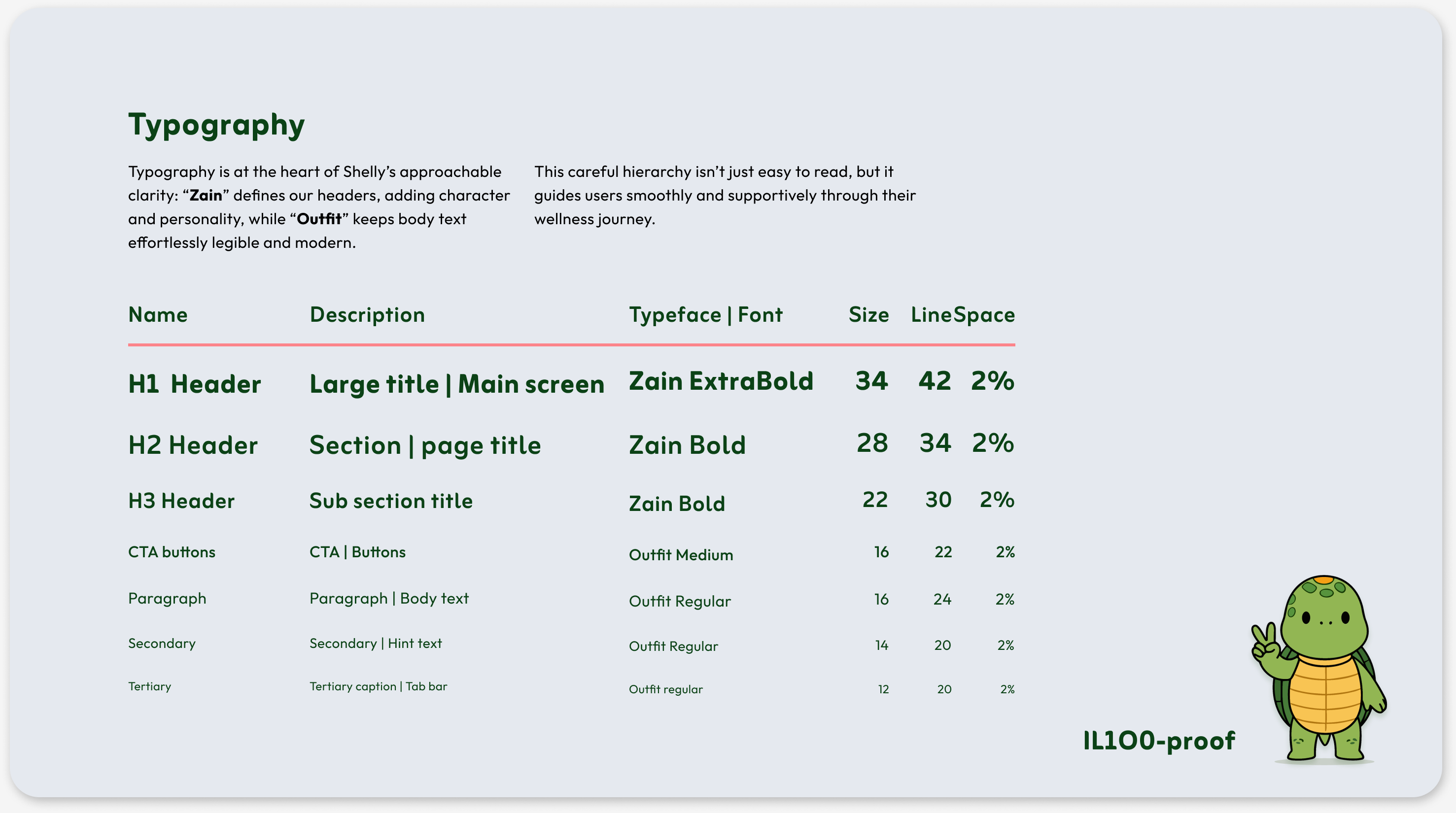
Shelly’s six screens follow Maria: an agency job in Barcelona, irregular hours, no appetite for another plan to fail at. Three sliders set the routine, days, minutes and intensity. The loading screen stays in character. Suggestions fit the day she is having, an exercise can be paused or skipped without penalty, and progress counts strawberries earned, not days survived. Around it, the identity from the research wall: nature greens, warm yellows, rounded type. All sixteen participants completed the core flow in the final usability round. In 2026 I redrew the same six screens by hand with text markers and set them moving.
The 2026 redraw
The 2026 redraw
In 2026 I redrew the same six Shelly screens by hand with text markers and set them moving. One day of scribbling with the turtle, the hare and the cream pages of a field journal, then two days of vibe coding turned the drawings into a working product.
Hi. I'm Shelly.
slow wins. ask the hare.
Set my routine
pencilled in, never carved in
Loading....
no peeking. well. maybe one.
fig. 2 · a walk, any pace
15 minutes of walking
15:00
45 strawberries at the end
fig. 3 · reach, then breathe
01:12
done counts, at any length
The harvest
‹Aug 4th - Aug 10th›
189
You met your goal 3 times!
Breathe
3 min
Walk
15 min
Stretch
15 min
Bonus
30 min
Finally an app that feels like a friend.
The line above came from a participant in the final round of usability tests.
Use of AI
Use of AI
Shelly’s 2025 sprint was human work, with Anna, no AI in the loop: full UX research and a full UI trajectory, sixteen participants, twenty-six screens, from interviews, affinity mapping and personas through user flows and usability rounds to a hi-fi prototype in Figma.
The screens above are the 2026 side. The Figma prototype already moved, smart animate saw to that. I wanted to iterate it with code and improve the design along the way. It started on paper again: the mood sketched by hand, coloured fast with text markers, the turtle, the hare, the cream pages of a field journal. One day of scribbling, those drawings were the premise. Two days of vibe coding turned them into a working product: the sliders drag, the loading screen changes its mind, the dashboard leafs through week, month and year. Three directions came out of those three days; this one won. I directed every choice, which lines wobble, which ideas live, where the hare runs.
The research and the tested flow are untouched.