
Airbnb · 2024
What cloning Airbnb screen by screen actually reveals
A screen-by-screen clone of Airbnb's iOS app: a study in what drifts at scale and whether strict atomic design could hold it together.
In short
Cloning Airbnb screen by screen shows how much inconsistency even a polished product can absorb.
A documented audit and a concept rebuild with full atomic consistency, offered as a study, not a correction.
- Sprint, clone to concept
- 40 hours
- Font styles in one flow (audit)
- 9+
- Corner radius variants (audit)
- 12+
I wanted to know what a design system looks like at Airbnb’s scale, up close. So I cloned the iOS app screen by screen in a 40-hour sprint. Up close it is messier than the polish suggests. Most systems that have shipped fast for a decade probably are.
What the clone revealed
The audit
Cloning Airbnb’s current app was a nightmare, in the useful sense. Over 9 font styles in a single flow. Corner radii that vary at random. Back arrows and cancel buttons that change style and position between screens, so users keep re-orienting themselves. That visual drift costs attention and weakens the sense of control.
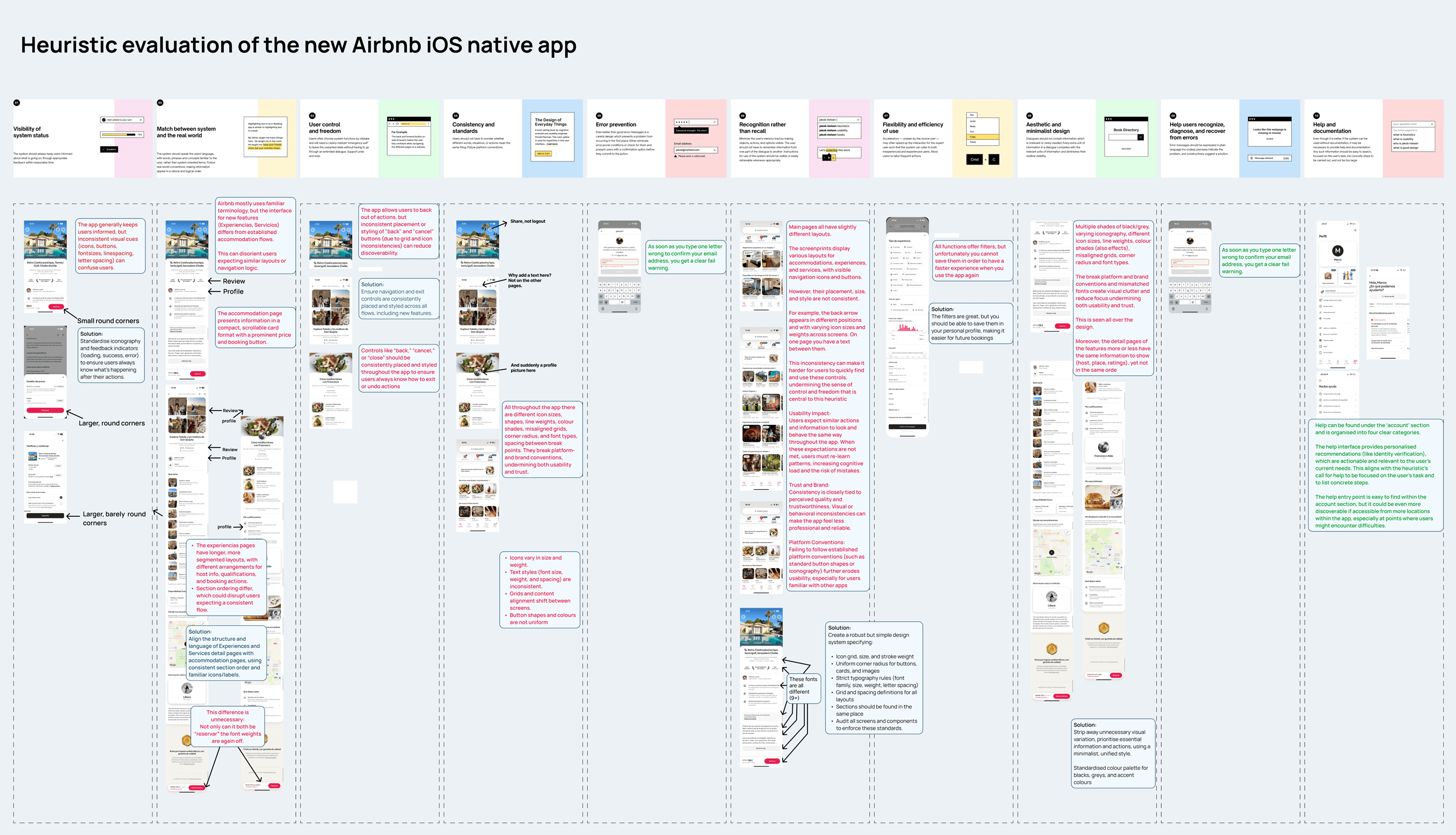
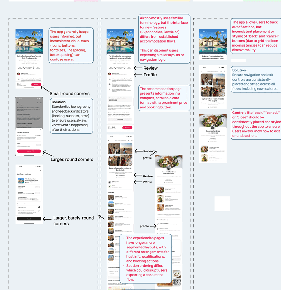
Inconsistency at this scale is what a decade of shipping fast looks like up close.
Groundwork
From atoms to pages
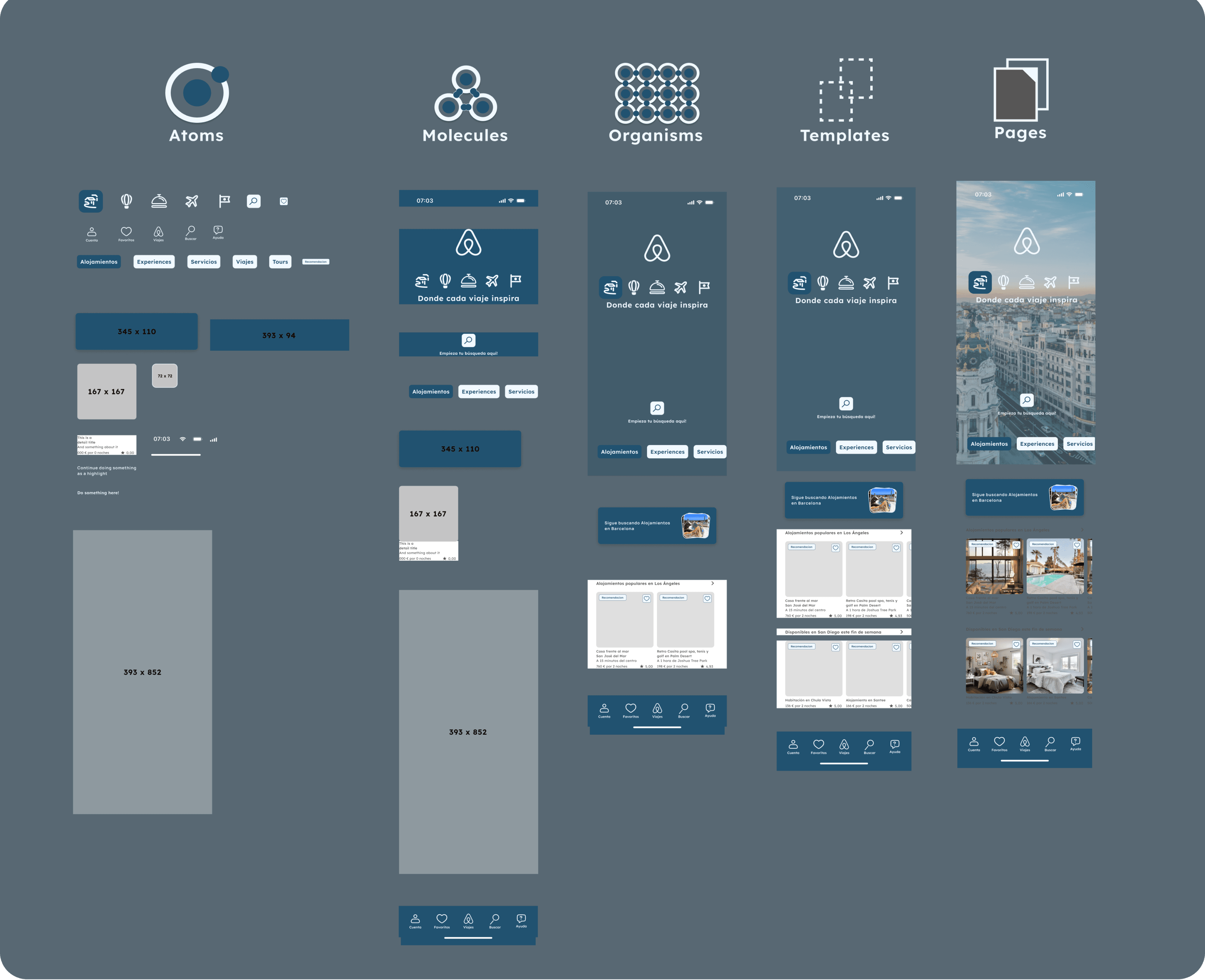
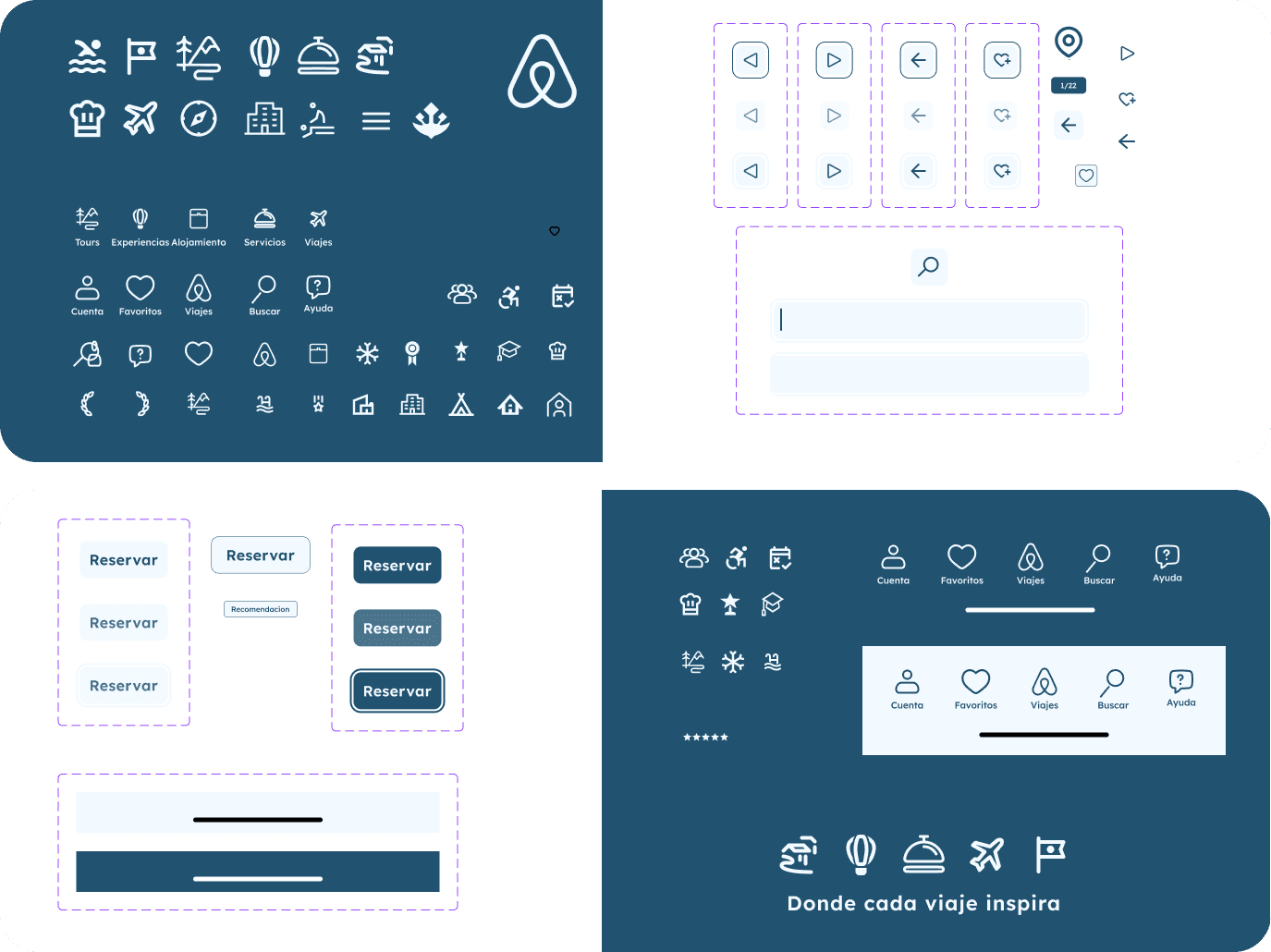
With Airbnb’s typography, radius and control inconsistencies documented, I tested whether strict atomic design could resolve them. A modular system from scratch: a strict icon grid, uniform 8px corner radii, a standardised palette. Every screen shares the same foundation. The redesign is a concept, not a shipped product; one possible answer to what the audit surfaced.
01 · Typography
Legible typography
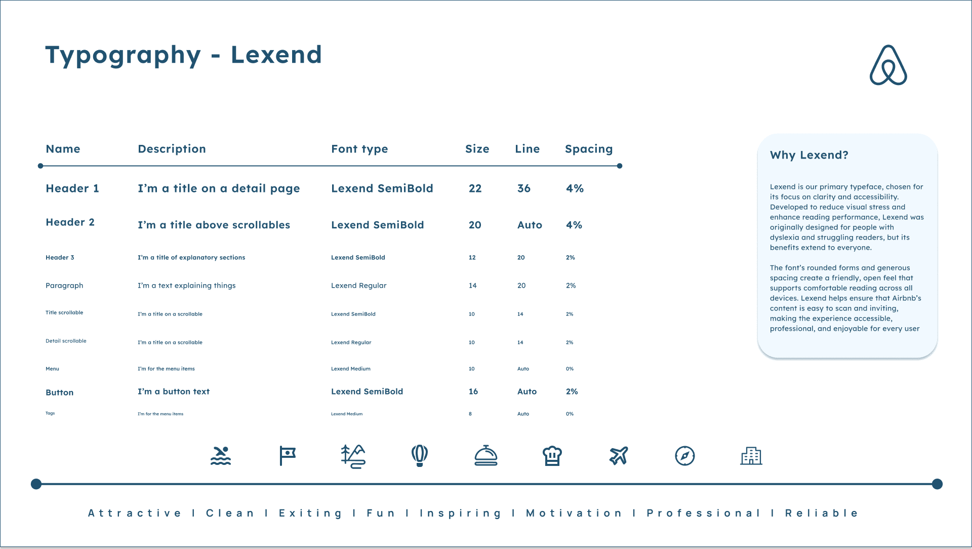
Lexend as the redesign’s primary typeface. Rounded forms, generous spacing, better readability for a broader range of travellers.
02 · Consistency
Unified components
The redesign: one icon grid, one button system. Every interactive element shares the same stroke weight and corner radius, so nothing has to be relearned between screens.
03 · Experience
Calmer discovery
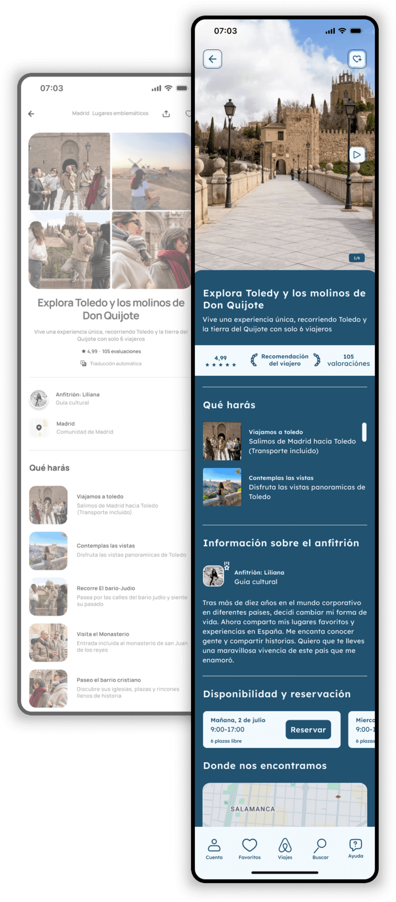
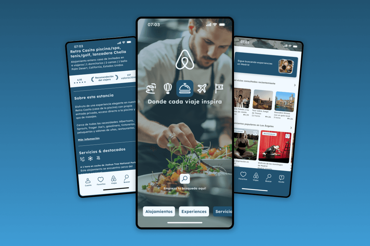
The redesign applies the new system to Airbnb’s stays and experiences discovery flow: the same icon grid, the same corner radii, the same type. Nothing here is new content, only a calmer version of what already exists.
Honestly, though
What this exercise showed
This was an exercise, and Airbnb ships under constraints a 40-hour clone never meets: legacy, experiments, teams moving in parallel. That is exactly what made it worth studying. The rebuild showed full standardisation is possible: icons, buttons, radii and type under one system, controls that stay put, a modular structure that could expand quickly. What I took with me: consistency is a structure you commit to at the start, or pay to retrofit later.