
EVVO · 2024
Helping people buy gear without reading an essay first
A French snowshoe brand with award-winning tech that nobody understood. The site needed to sell the story, not the specs.
In short
Buying gear meant reading an essay before you could add to cart.
A story-first redesign: activity-based navigation, benefit-first cards and a comparison tool, validated in usability testing.
- MVP design sprint
- 6 weeks
- Could say why EVVO was premium, before the redesign
- 1 in 3
- Of mobile visits bounced off the old desktop-first site
- 70%
EVVO Snowshoes is a French brand with patented lightweight technology, bio-sourced materials and a Michelin partnership. Award-winning products, and a site that read like a technical catalogue: dense specs, a buried value proposition and navigation built for engineers, not for people who shop on feel.
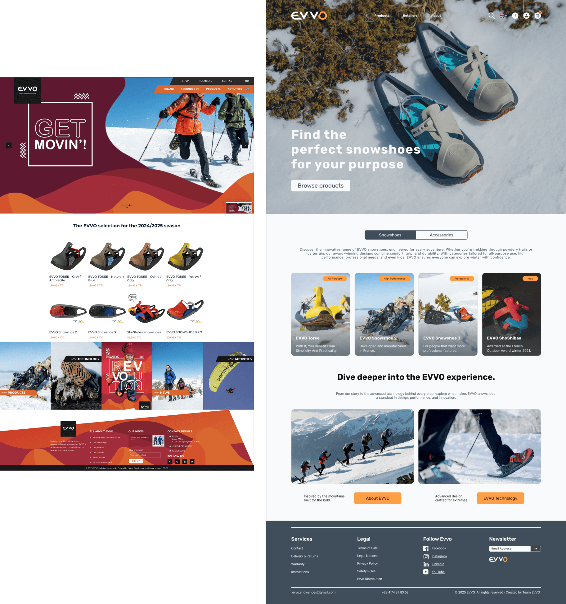
Invisible innovation
Premium gear that couldn’t say why
The research showed a simple disconnect: users could not tell why EVVO was premium. Only 1 in 3 understood the sustainability angle, and 70% of mobile traffic bounced off a desktop-first experience. The innovation was buried under jargon. The job: make the shop sell the story and make choosing a product quick and confident.
From specs to story
Three findings set EVVO’s strategy. The differentiators, Michelin soles and recycled materials, were invisible in the copy. There was no responsive design, while most research happened on mobile, against dense cards, unclear sizing and no comparison tools. And interviews kept saying the same thing: shoppers wanted comfort, quality and sustainability, not feature tables.
I need to trust the gear before I buy it. I don’t care about specs; I care about safety.
The user in one line: the cautious adventurer, straight from the interviews.
Groundwork
A streamlined path
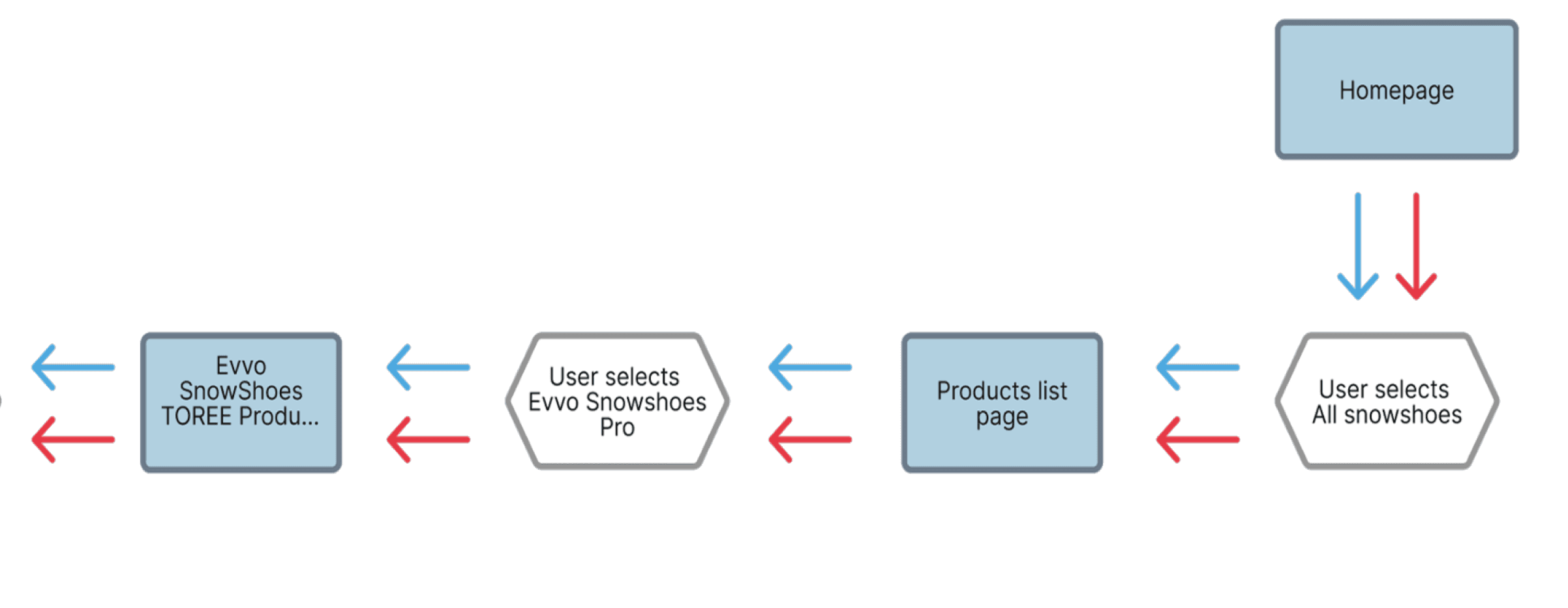
We replaced EVVO’s spaghetti of technical categories with a linear finder flow. Need-based questions instead of a catalogue: less decision fatigue, a shorter path to checkout.
01 · Homepage
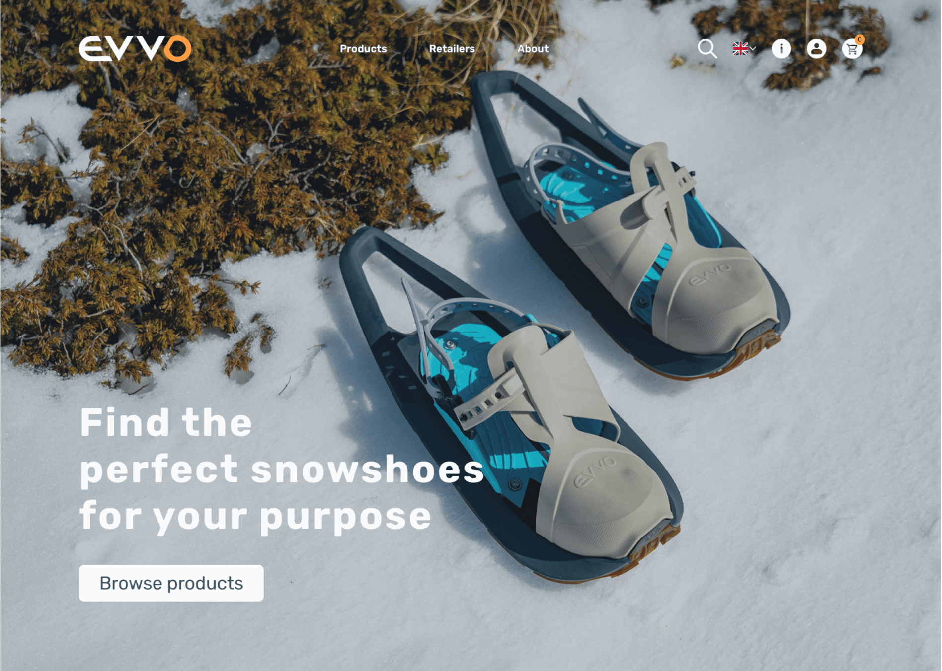
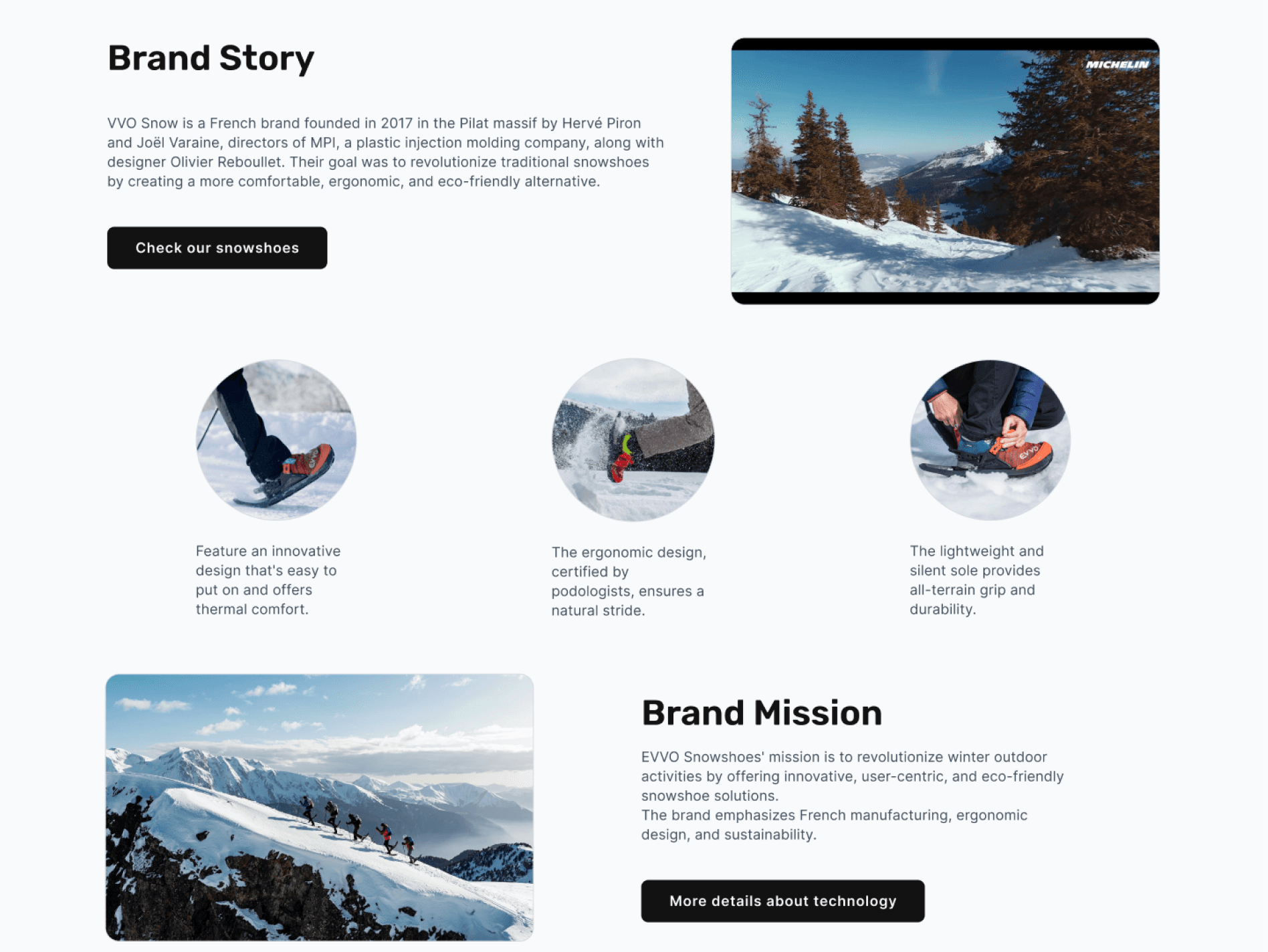
Narrative homepage
The story goes first: why EVVO matters before what EVVO sells.
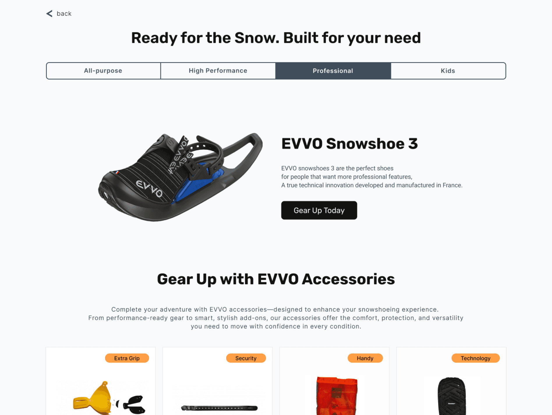
Need-based navigation
EVVO’s eight technical SKU codes became activity-based categories, so users self-segment instantly. Product cards follow the same logic: image first, benefit one-liner second, spec last.
03 · Decision support
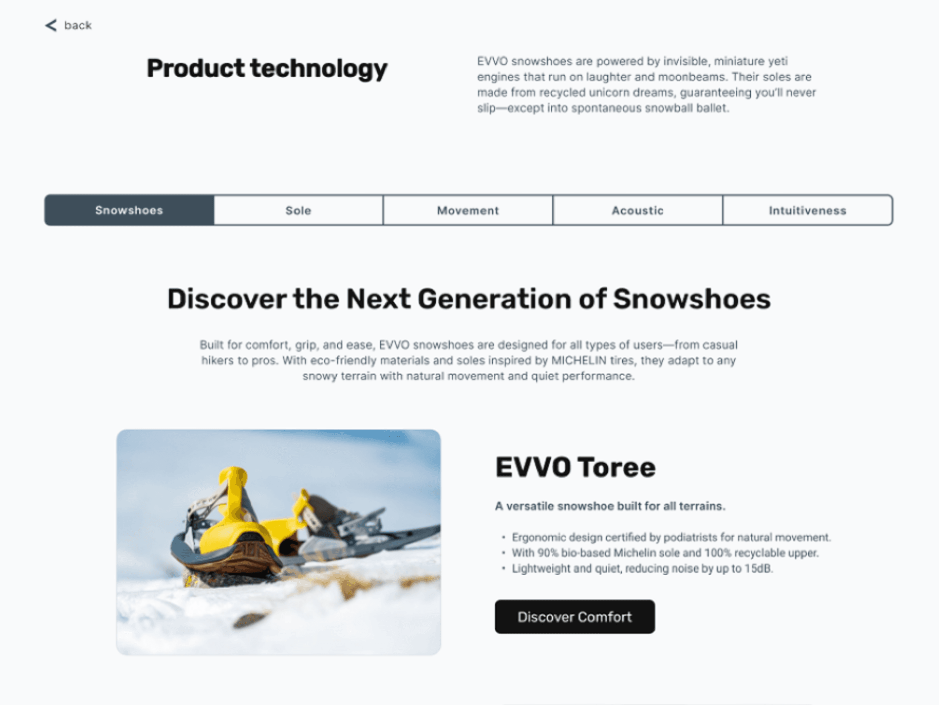
Confidence-building comparison
EVVO’s side-by-side tool weighs priorities like grip against weight. It answers the fear our research kept surfacing: buying the wrong gear.
04 · Product pages
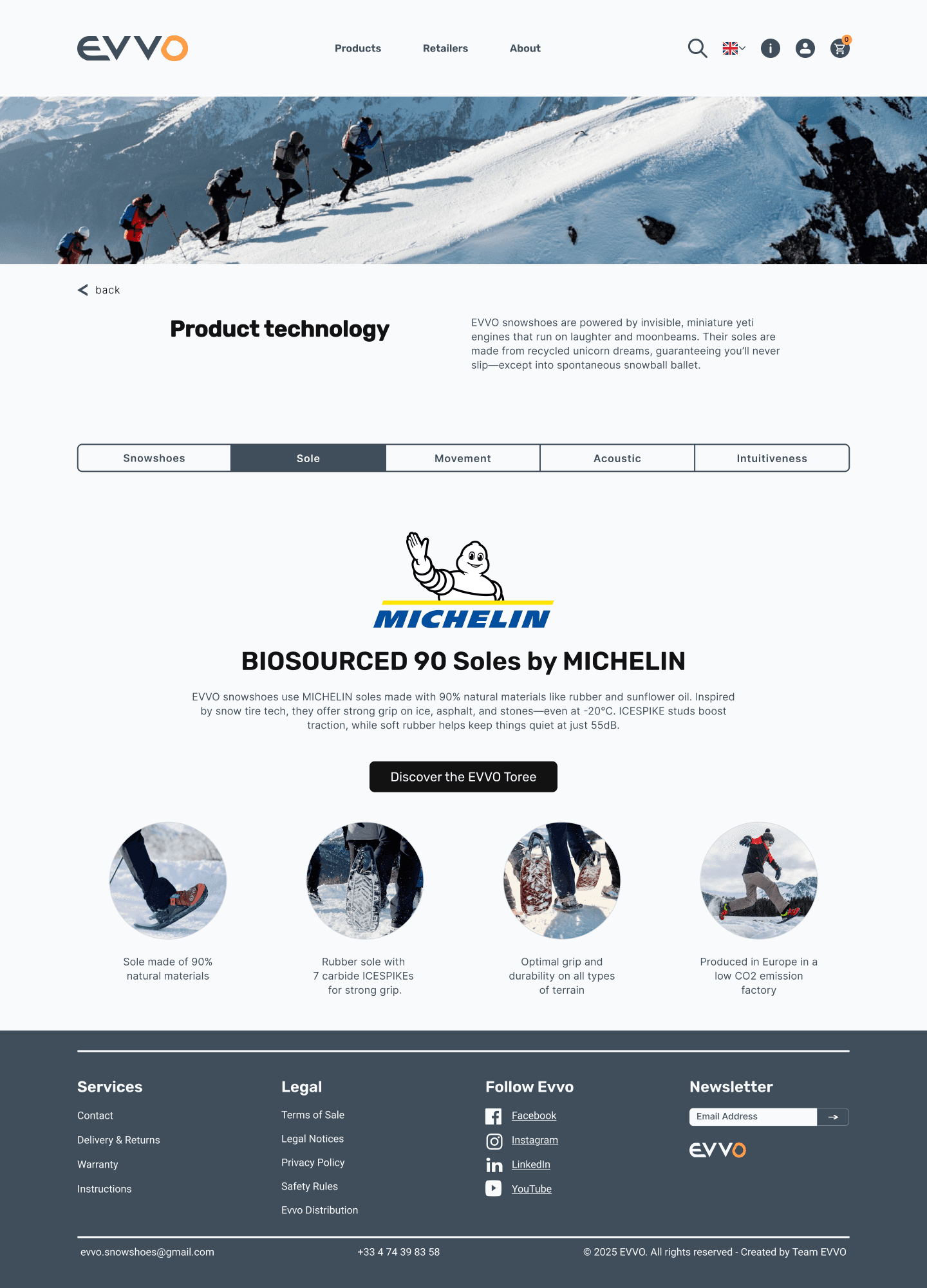
Story-driven product pages
EVVO’s Michelin technology explained through story and visuals instead of a table, recycled materials argued as benefits.
The craft layer
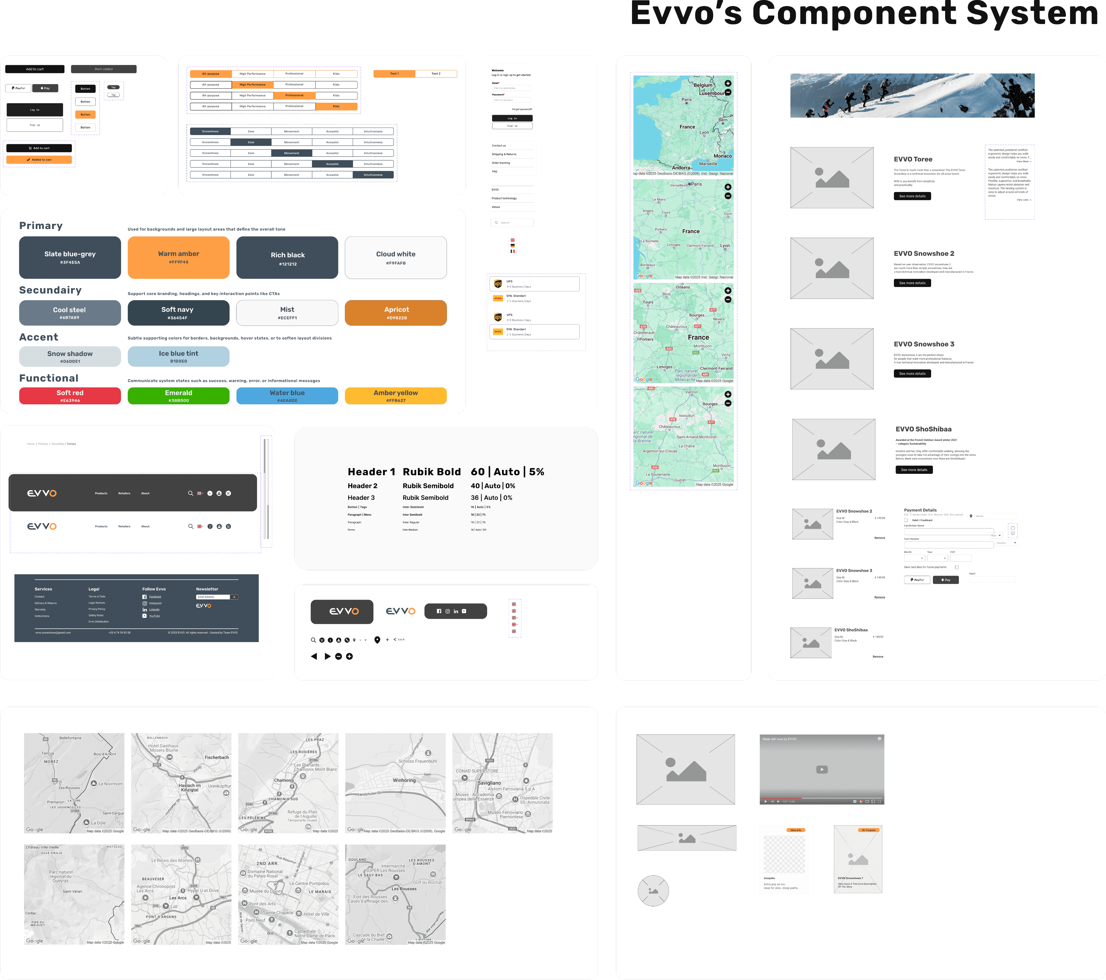
Built for scale
EVVO’s modular component library, atomic design and auto layout throughout.
Honestly, though
Impact and reflections
EVVO’s hypothesis: lead with story, support with specs. In usability testing people understood the product faster and chose with more confidence.
Conversion needs a live shop to prove it. The judgement stands either way: a spec sheet convinces nobody, and every screen now leads with the reason the product exists.