
Urbiqo · Since 2025
Verifying hosts and tenants before anything goes wrong
How excluded tenants and risk-averse hosts end up on the same platform.
See it live on staging →In short
Room rentals run on blind trust. Hosts and tenants commit before anyone knows who they are dealing with.
Designed end to end, then built by me on Next.js. The platform is live on staging; launch still ahead, no user metrics yet.
- Built and live, launch ahead
- On staging
- Research to production UI
- 4 months
- Tenants and hosts, one platform
- 2-sided
Madrid is booming and its rental market has not caught up. The filters are stuck in another decade: no permanent contract, no flat. That locks out solvent tenants and leaves hosts choosing from a smaller, samey pool.
The paperwork wall
Solvent, and still locked out
On Urbiqo, freelancers and expats hit closed doors, blocked for lacking a standard payslip however solvent they are. Hosts are stuck too: rigid paperwork is the only risk tool on offer, so they use it. Urbiqo does not throw that paperwork away; it adds more ways in. A tenant can name a guarantor, family help counts as a real answer to how the rent gets covered, and an optional background step lets them tell hosts who they are: why they are moving, how they live, how they rented before. Hosts decide on more evidence, and solvent non-traditional tenants get through the door.
The problem was never the listing. It was the leap of faith on both sides of it.
Groundwork
Mapping the full journey
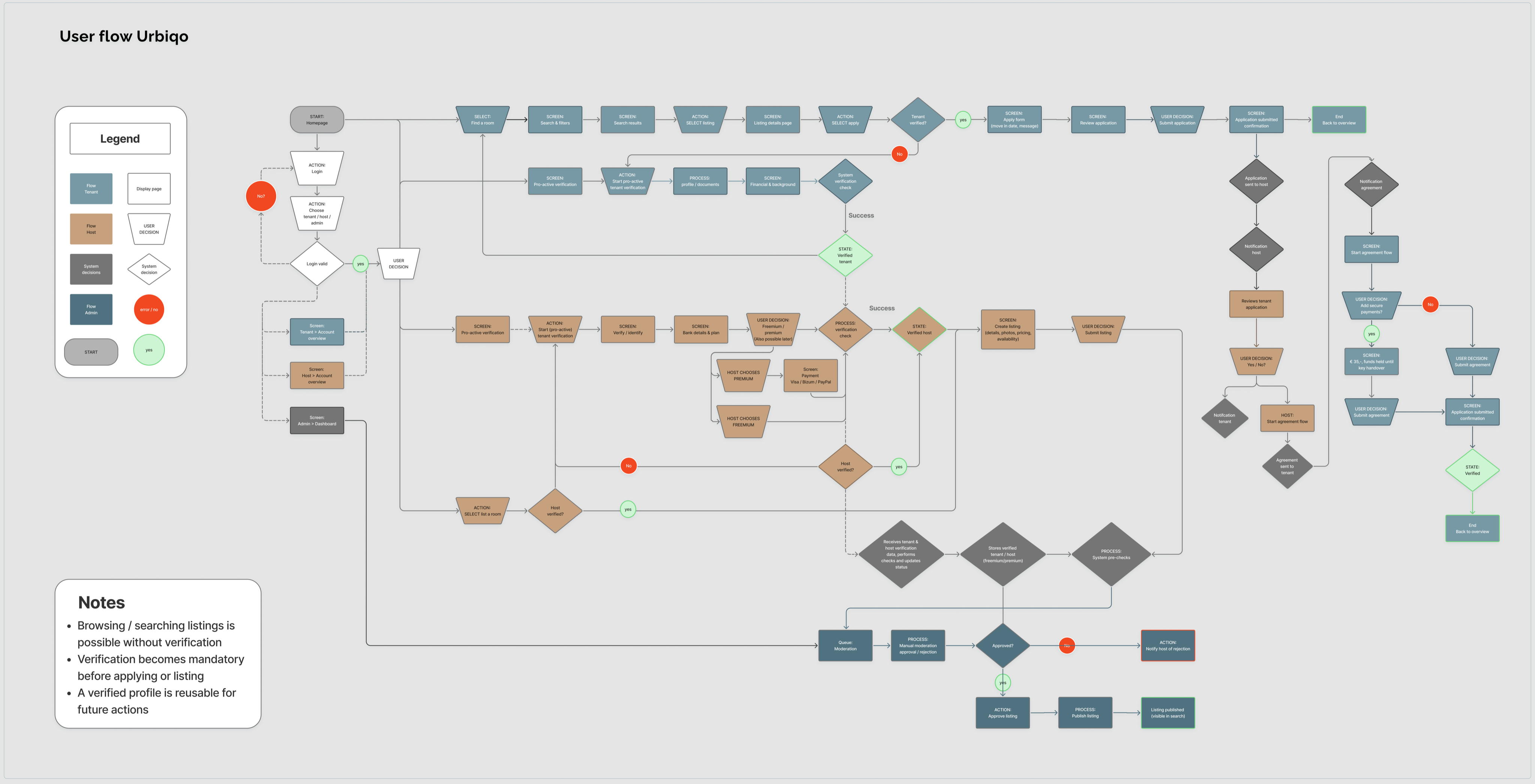
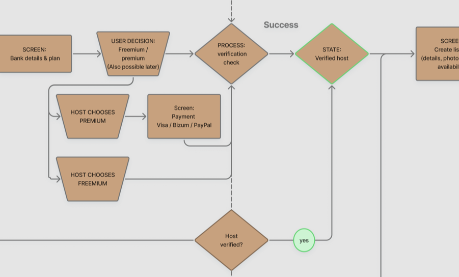
Before any screens, I mapped Urbiqo’s complete flow for both sides: every decision point from first login through verification, application and payment. It became the source of truth for what to design first. It also fixed three rules the product had to honour: browsing stays open without an account, verification becomes mandatory at the point of applying or listing, and a verified profile is reusable across applications.
Two sides, one problem
Urbiqo has to hold two realities at once.
THE TENANT · freelancer, solvent, no payslip
Stable annual income, no fixed monthly contract. They stall at the upload screen because the form expects a payslip that does not exist. They need alternative proofs read as legitimate evidence.
THE HOST · one empty month vs one unpaid month
An empty month costs money; an unpaid month costs more. Paperwork is their proxy for reliability because nothing better is on offer. They need a signal that does not filter out good tenants for the wrong reasons.
The difference Urbiqo bets on: validating reliability, not just salary.
01 · Verification
Fairer screening
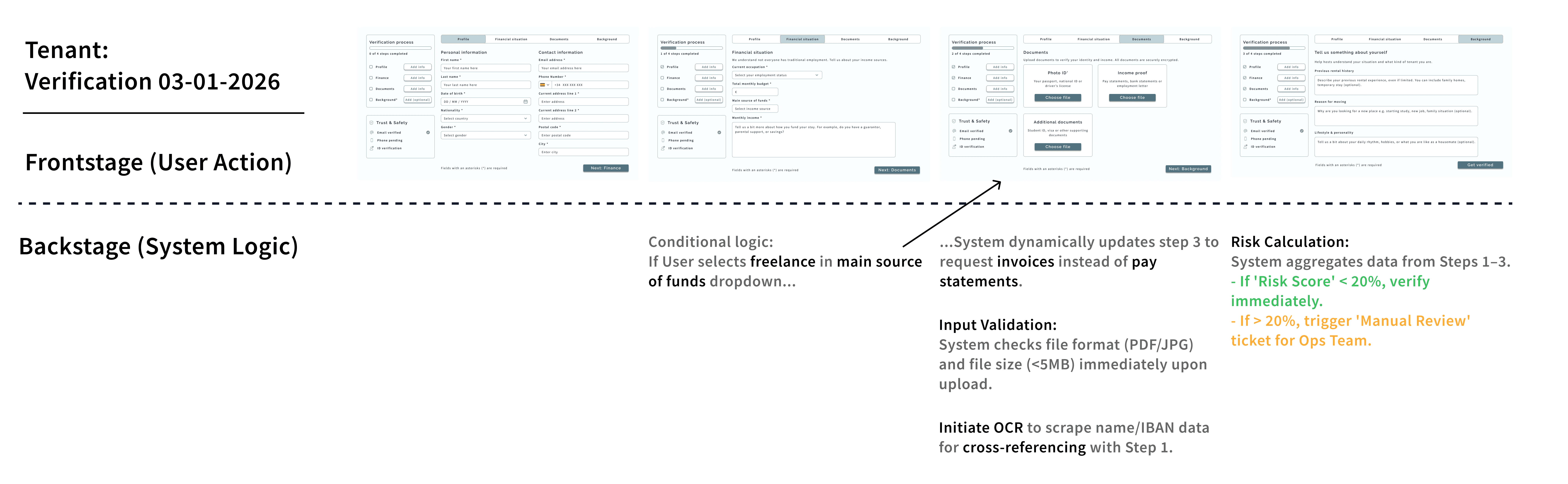
For Urbiqo, I added alternative proofs beside the classic payslip: bank statements and invoices. Employer letters and tax returns were considered and dropped, both lag actual cash flow. Bank statements and invoices reflect it in real time, and validate through OCR with manual review for the edge cases.
A service blueprint maps the backend logic that adapts verification requirements to the user’s status, accepting invoices for freelancers, for example.
02 · Trust
Humanising the transaction
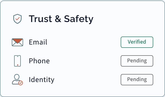
On Urbiqo, a verified profile travels ahead of the tenant. The host sees the same verification card before any meeting: email, phone, ID and background check. Hosts declare their relationship to the listing too, owner, tenant or intermediary, so applicants know who they are dealing with. Trust is visible on both sides before anyone books a viewing.
03 · Clarifying
Demystifying the process
Renting on Urbiqo is overwhelming enough. The landing page works as a calming filter: the verification journey compressed into four linear steps, understood before anyone creates an account.
Positioning
Where Urbiqo sits
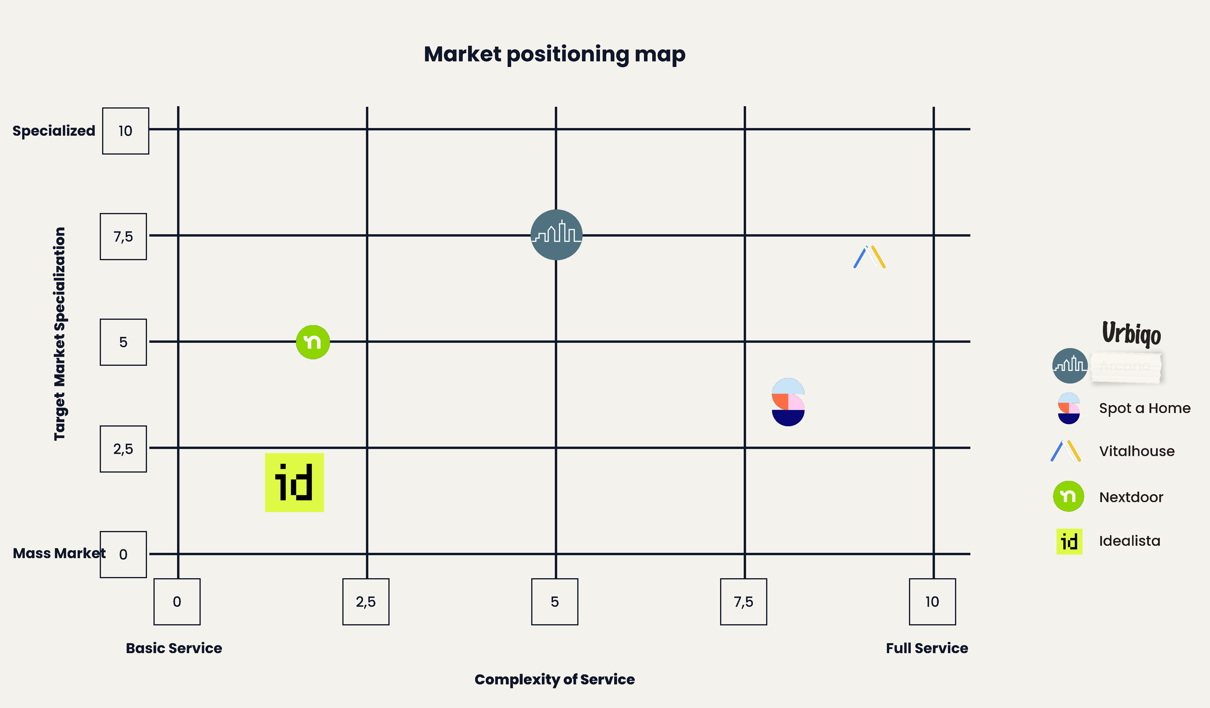
I mapped the Madrid market on two axes: complexity of service and target specialisation. The gap: nobody combines trust-based verification with accessible pricing for freelancers, expats and non-traditional tenants.
The craft layer
Behind the screens
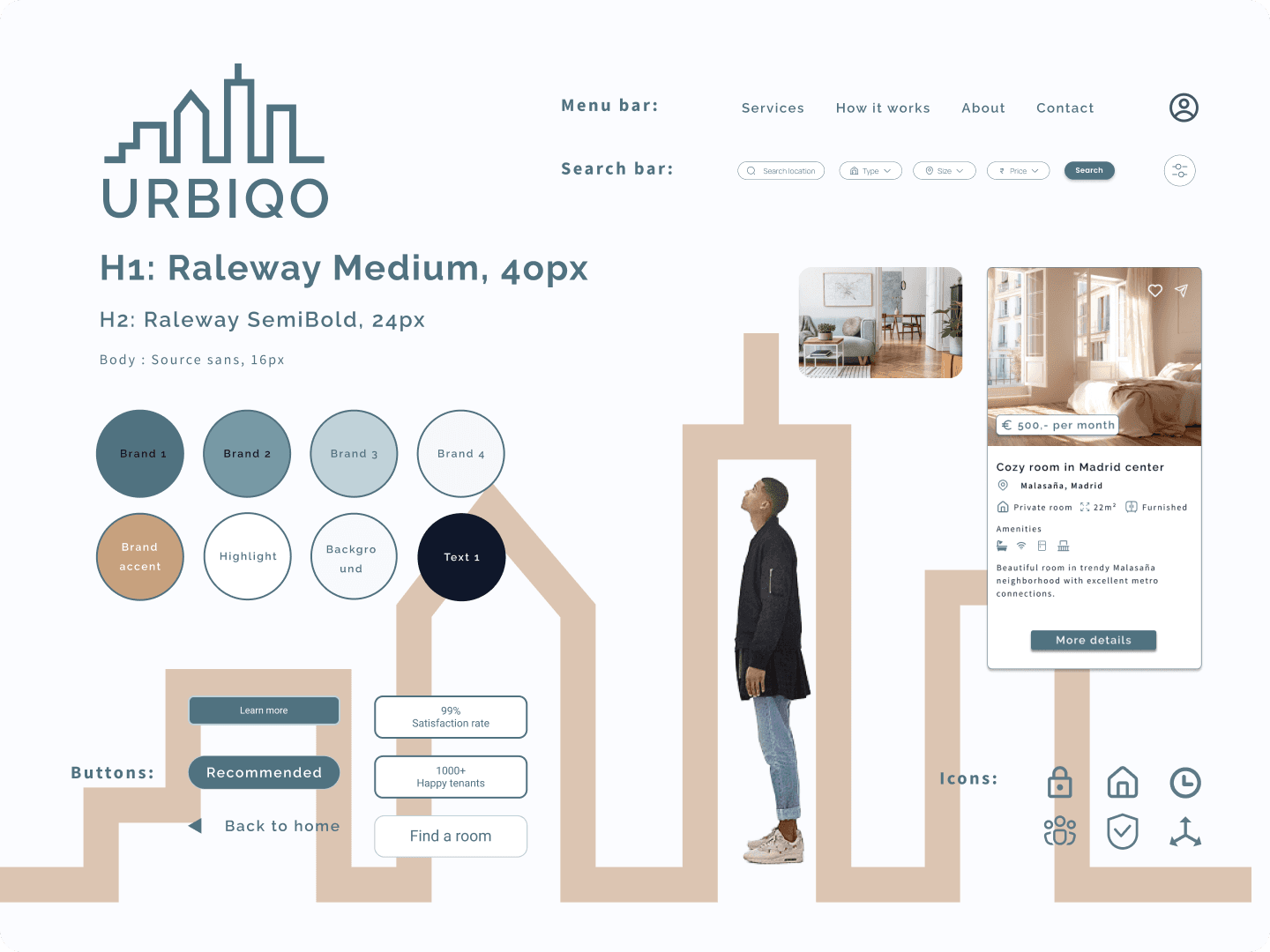
Urbiqo’s system underneath: tokens, components and variable theming for dark mode and English/Spanish localisation. Built alongside the product, kept as its own reference.
Third act
Designing it was the easy part
Urbiqo’s design was defined, the system documented, the flows mapped. Then I built it, on Next.js, the entire build AI-developed with me directing: AI wrote the code, I briefed it, reviewed it and sent it back until it matched the design. Building your own design is the most honest usability test it will ever get. Every screen I signed off as a designer had to earn its way through real components, real data and real states.
Some decisions did not survive contact with code. A flow that looked clean in Figma met loading states, empty states and awkward real content. I was the designer who had to admit it and the developer who had to fix it, so the iteration loop ran in minutes, not sprints. The product on staging is the result.
The biggest kill was my own design: hosts originally got a separate verification flow. I folded it into the listing flow, one page, because putting a place online has to be simple.
One detail only appeared once there was a front end to run it: every section heading draws itself in from the left, behind the terracotta skyline. A motion decision made in code, not in the static design file.
Why Urbiqo
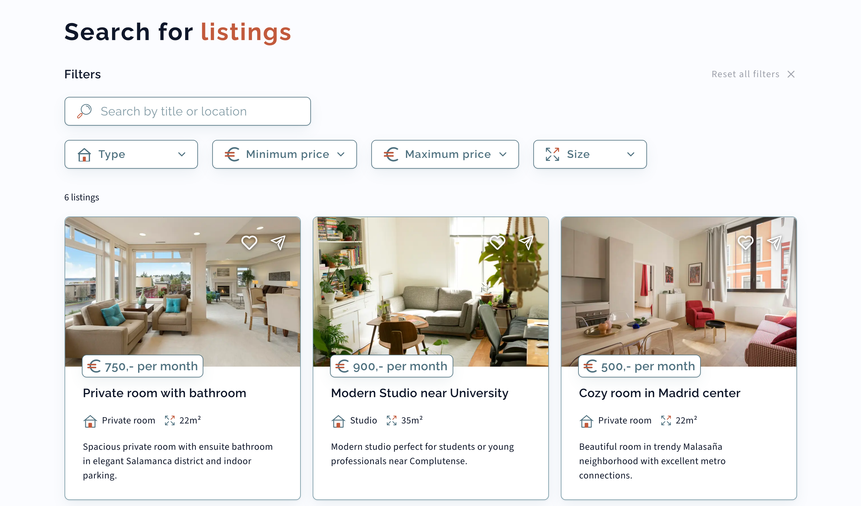
Live on staging today: featured listings; search with type, price and size filters beside a map; listing pages with gallery, amenities and neighbourhood notes; apply and contact host; freemium and premium tiers for hosts, tenants always free; full English and Spanish; a help centre, FAQs and a contact form that routes by topic. The listings are sample data for now, placeholders to exercise the flows end to end until real inventory arrives at launch.
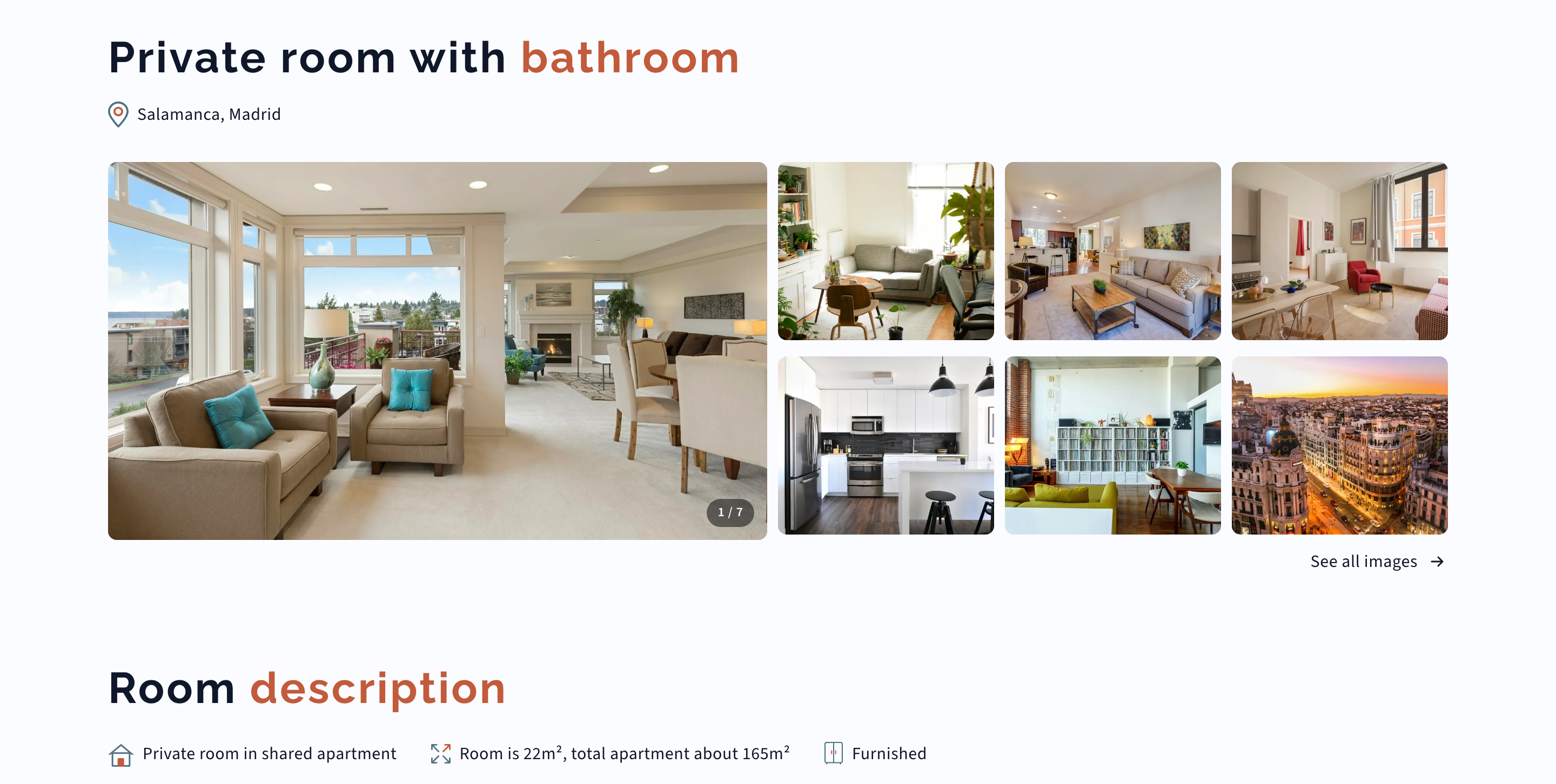
Three decisions from the build earned their own labels.
Build 01 · The restless card
The card that could not sit still
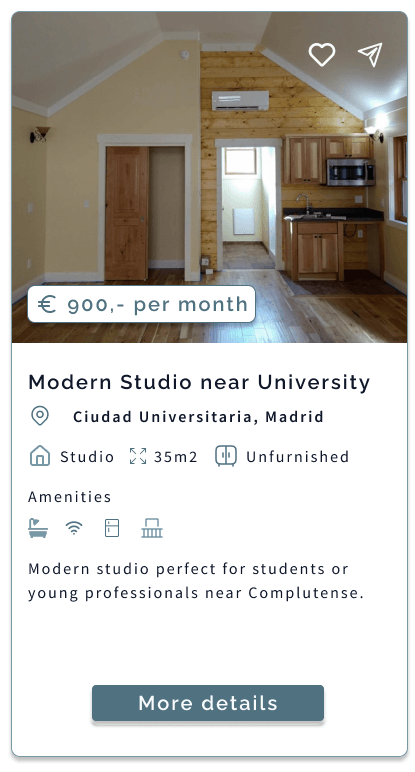
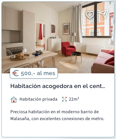
On Urbiqo, real descriptions vary in length, so the ‘More details’ button pinned after the text could never sit still. The title now clamps to one line, the description to three and the whole card became the click target.

Build 02 · Honest pills
A pill should never lie about why it is red
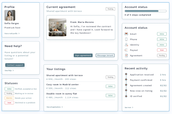
On Urbiqo, the verification thinking from earlier survived into code as the trust and safety card on every listing. Each signal has its own state: a profile can show email verified while phone and identity are still pending.
In the design file the four states were a legend: Active, Pending, Attention and Issue, one pill per signal. In code every pill needed a source of truth and a failure story. A signed-out user stopped being treated as an error, and one blanket ‘something went wrong’ was split into its distinct causes, so a red pill always means one specific thing.
Build 03 · Half the words
Only half the words are mine
Urbiqo’s localisation was designed as a variable mode and shipped as one. The same screens run in English and Spanish end to end.
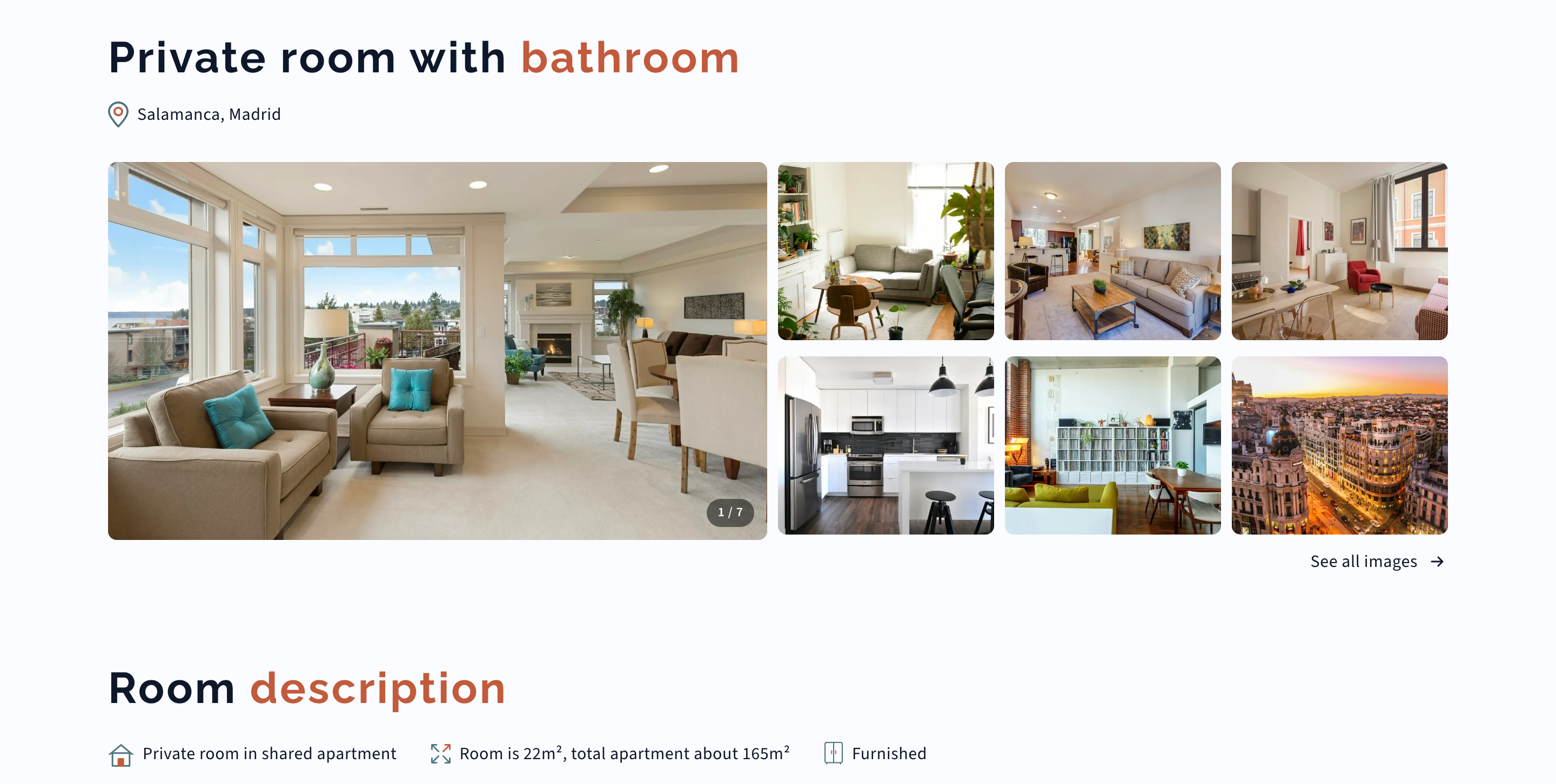
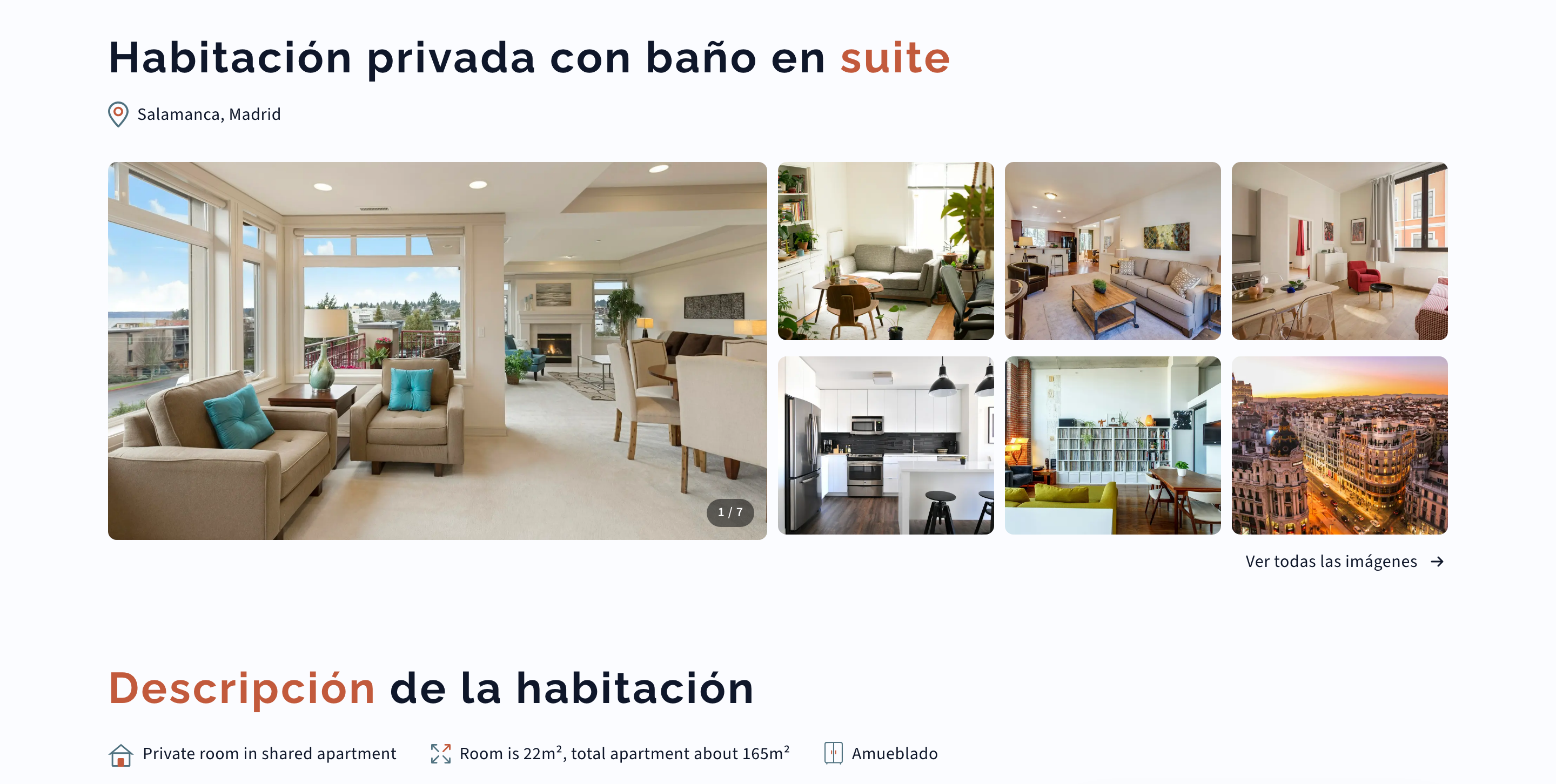
The design file flips every string with one variable mode. The build corrected me: interface copy translates, but listing content lives in the database, so a Spanish page can still speak English wherever the data does. And Spanish runs long enough to truncate cards the English never stressed.
Use of AI
Use of AI
Urbiqo: two kinds, and they should not be confused. The build: the entire platform was AI-developed under my direction, AI wrote the code, I briefed, reviewed and sent back until it matched the design. The product: Urbiqo itself runs on AI that can be wrong, OCR reads the verification documents. So I designed for the times it gets it wrong: manual review catches the edge cases, risk scoring escalates to a human, and every status pill tells the truth about why it is red.
What I learned
Urbiqo: designed end to end, then built end to end, by one person directing AI, on Next.js. That is the outcome: a two-sided platform running on staging in two languages, from search to application. No user metrics yet, the launch is still ahead, so what follows is what shipping it taught, not what the market said.
Three things Urbiqo taught me:
- Two-sided trust is its own discipline. Everything that removes friction for tenants, fewer documents, faster checks, adds perceived risk for hosts. Balancing that tension shaped the whole product structure.
- The gap between a founder’s concept and a buildable product is bigger than it looks. The vision was clear. The design work was turning it into conditional verification logic, system states and edge cases.
- The visual layer carries more trust than I gave it credit for. People hand over personal documents here; every colour, interaction and line of copy either builds confidence or erodes it. I would budget more time for that layer next time.
Honestly, though
Status and next steps
Staging went live on 6 July 2026 and the platform runs at staging.urbiqo.com, in English and Spanish. It is in active QA now, the day-to-day is correcting what real screens, states and content expose before launch. The bet: put verifiable trust signals beside the rigid contract requirements and the market opens on both sides. Unproven until launch, but the logic holds. If you can verify reliability without demanding a permanent contract, hosts get confidence and tenants get access.