
FLIZpay · 2026
Sell the difference, not the checklist
Redesigning FLIZpay's merchant dashboard and payment app around the cashback that sets them apart.
FLIZpay is a German open-banking payment company. The consumer app is the payment system itself: you pay a shop straight from your bank, and FLIZ pays you a percentage back as cashback afterwards. Merchants offer that cashback to pull payments onto FLIZ, and a separate merchant dashboard is where they set it up and watch it work. I spent twelve weeks inside the FLIZ team, working closely under the design lead and in daily collaboration with the developers, across both surfaces, two products with very different jobs. The pace was set by constant releases. The largest of them was the overhaul of the merchant dashboard, and along the way I took on product strategy, the design system and QA.
01 · The differentiator
The differentiator that was hiding
Every payment tool competes on the same checklist: invoicing, reporting, permissions, roles. Useful, expected, and never the reason anyone switches. I spent the early weeks pulling that field apart feature by feature: first my own close look at the nearest rivals, then AI filling the comparison matrix against parameters I had fixed, which showed me the ones I had missed, then a last pass where I walked the competitors’ apps and sites myself, because an unverified matrix is an opinion. The pattern was the same everywhere. The checklist was table stakes. It was never the battleground.
The one thing FLIZpay did that nobody else did was the thing the product talked about least.
The edge is the cashback: FLIZ pays customers back for paying by open banking, and merchants set the rate to bring shoppers in. That mechanic was buried, one value story lost among a dozen parity features. So the brief rewrote itself: stop matching the checklist, and put the difference where it cannot be missed.
02 · The overhaul
The company account, rebuilt around the cashback
A merchant should not log in to look at their account. They should log in to run it. The dashboard has one job, and it is not taking payments, the app does that. It is where a merchant sets their cashback rate, watches it perform and keeps the shop connected. So we rebuilt the FLIZ Company Account around that one job: the cashback, its performance and its setup all one glance away. I owned much of the early work, the research, the structure and the MVP that proved the direction, always under the design lead’s guidance and with engineering at the table. (The interface labels the rate a discount; the customer receives it as cashback.)
It started as the MVP for the overhaul: the redesign pared back to its structure, enough to prove the direction before the high-fidelity pass.
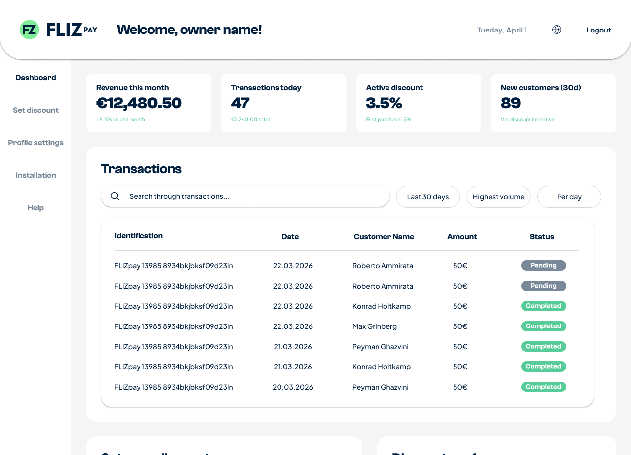
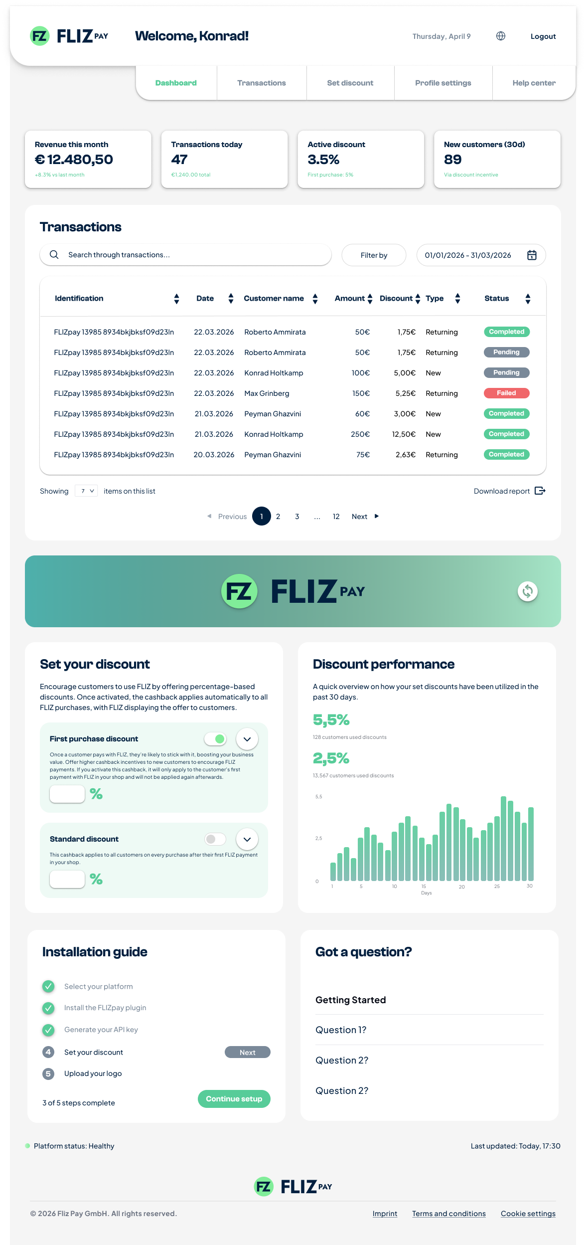
The real areas do the work: a KPI strip, a filterable transactions table, discount performance, an installation guide, and a live platform-status line, the whole account readable and runnable from one screen.
The KPI moment
A number, before anything else
The first thing the dashboard shows is not a menu. It is four numbers. That was the design decision: a single, honest value should greet the merchant before they do anything, so the account answers how are we doing? on sight.
The sample values shown are the placeholder figures from the design file, not business results.
03 · Status
Status you can trust at a glance
A payment either happened or it did not, and a merchant should never have to guess which. The transactions table runs on one status system with a fixed colour mapping, so a state means the same thing every time you see it: green settled, amber waiting, red failed, grey stopped.
Payment successfully processed and settled into your account.
Payment initiated, awaiting bank confirmation.
Payment could not be processed. Check transaction details.
Transaction was canceled by the user or system.
04 · Discount setup
Discount, promoted to a first-class area
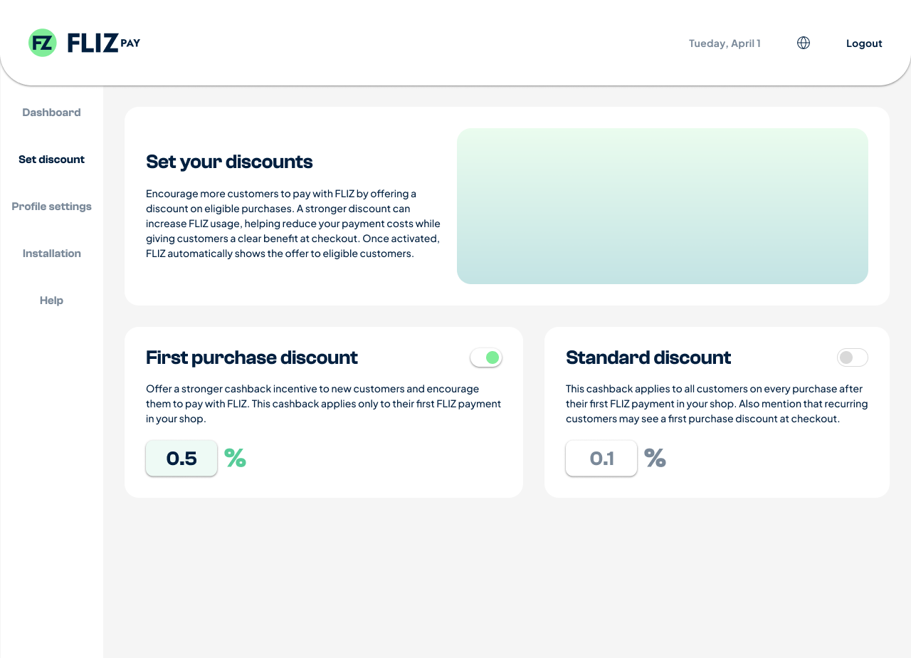
The mechanic that makes FLIZ different used to live where nobody looks: a row inside settings. I proposed pulling it out into its own space on the dashboard, and that is where it went. A merchant sets two rates, a first-purchase cashback to pull new customers in and a standard rate for everyone after, sees the effect in a live preview, and publishes. What the company is best at is now the easiest thing to do in the dashboard.
05 · Merchant guide
A merchant guide worth reading
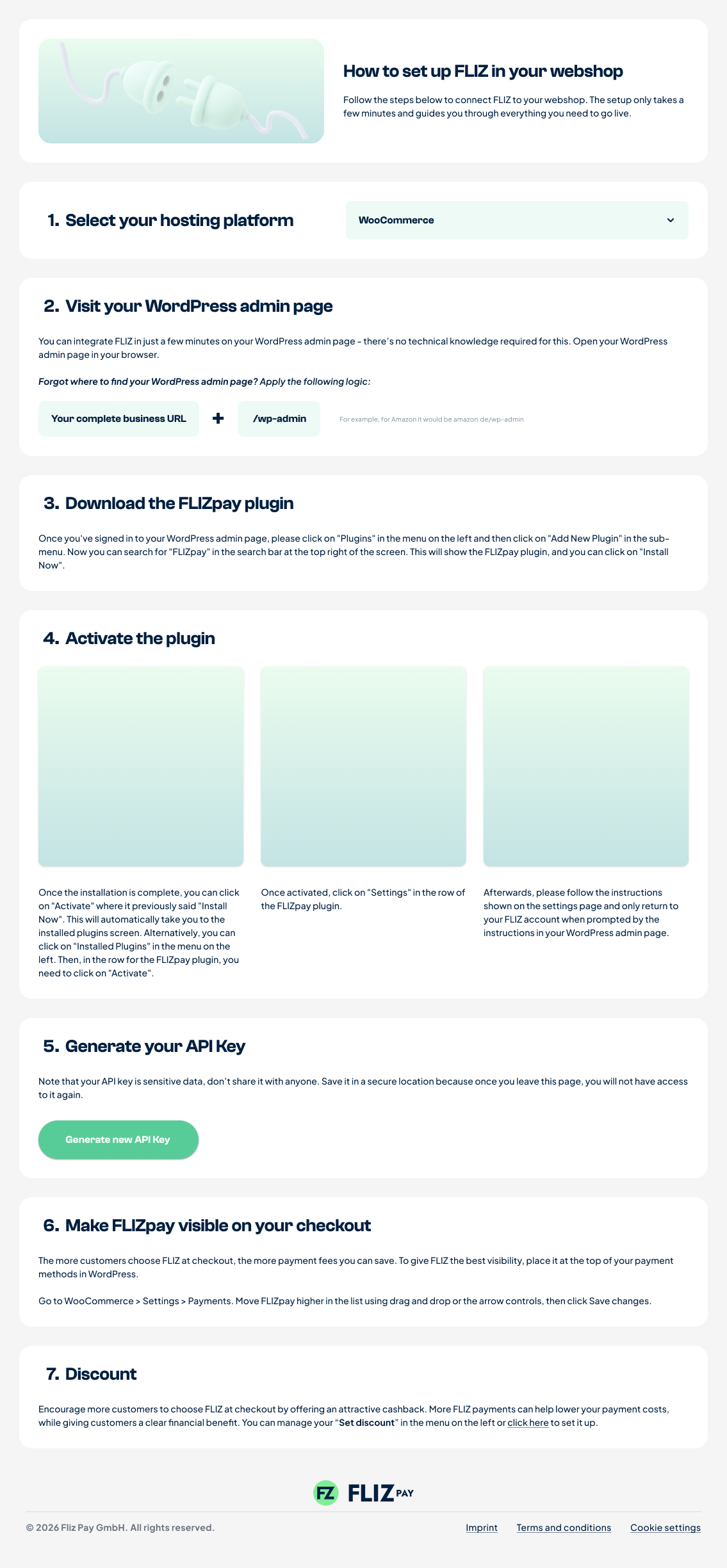
Onboarding a shop was a heavy, skippable tutorial. Working from the design lead’s direction, I redesigned it as a well-made, low-tech static guide, the kind of documentation you actually read, with Stripe’s docs as the visual reference: calm, sequential, no video to sit through. It was drawn as wireframes first and only then raised to high fidelity, so the structure was right before the polish went on.
06 · The consumer app
The consumer app: making saved offers findable
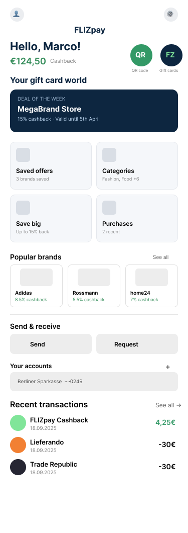
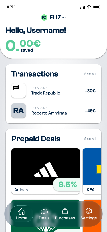
The app is FLIZpay’s payment system: it is how people actually pay, straight from their bank. The cashback offers ride on top of it, and that layer was buried. The catalogue, saved offers and filters all sat two or three taps deep, with no way in from the homepage, so the best reason to open the app was the hardest thing to reach. The claim needed proof, so I built the app’s full user flow in FigJam and turned it into a ticket: the most important function sat too deep to find. The CEO, the CTO and the design lead all confirmed it, and bringing it to the foreground became the work: on the homescreen, and prominent in a menu.
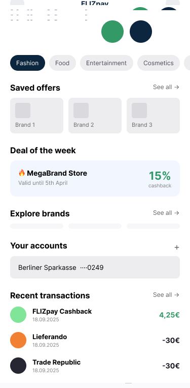
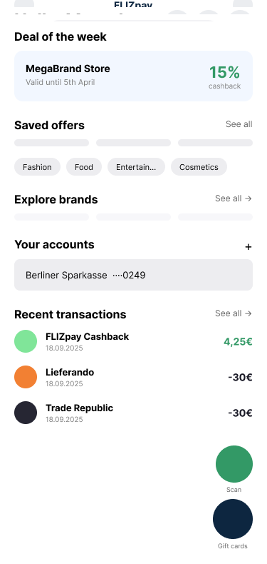
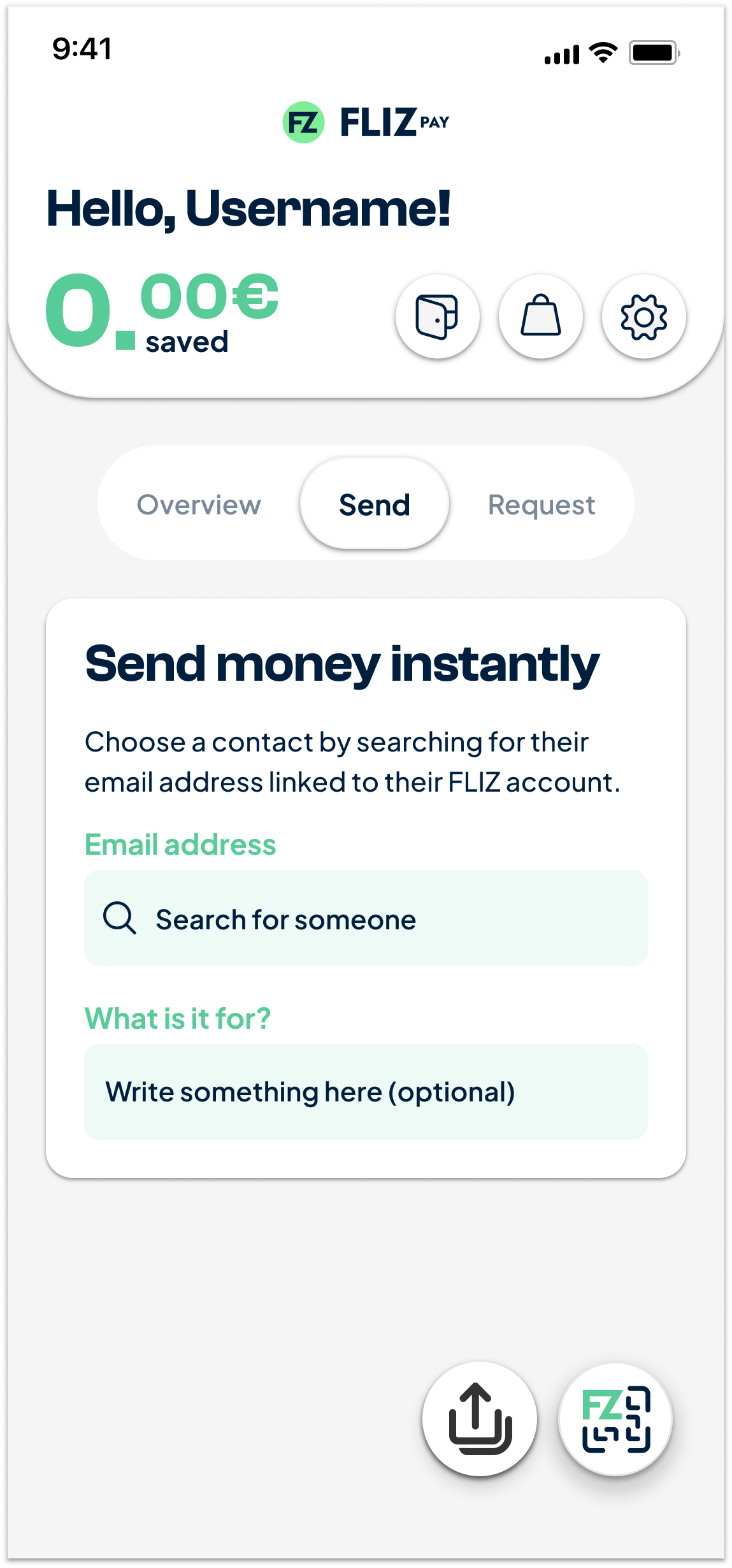
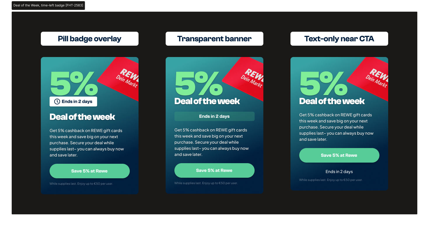
My first proposal was a hub button. I killed my own concept for a bottom nav (Balance · Catalogue · QR · Send), with the boring functions, settings and profile, tucked behind a profile button up top. Around it: homepage entry points that put offers on the first screen (category chips, a saved-offers tile, a deal-of-the-week card), a catalogue hub, and a post-purchase keep browsing? return flow so a completed payment leads somewhere instead of ending. The direction was independently validated by the lead engineer, and later evolved toward a glass-effect iteration. The sharpest cut was not mine: the product manager and the CEO scrapped the app’s send and receive functions entirely.
07 · Small decisions
Small decisions, real friction
The big structure only works if the small signals are honest. Saving an offer was marked with a paperclip, which reads as attach, not keep, so it became a heart. That freed up the urgency signal the paperclip had been muddying, and the deal of the week took a flame to say this expires.
Under the hood
Under the hood
Under the visible work sat the unglamorous kind, and it is where my division of labour with AI was sharpest. Roughly 1,150 layers renamed to sentence case and around 50 localisation strings fixed across EN/DE, with a pass over capitalisation throughout: AI did the bulk on a precise brief and proposed the language variants, I chose between them and checked the result layer by layer, so the design system read as one voice instead of five. And so it would stay that way without me, I wrote the guides to go with it: how to work with the variables, how to handle localisation. Documentation that makes the next designer faster with nobody in the room. The same split carried the brand work. The identity had just taken a new direction under the design lead, and I worked with her to push it through everywhere, iconography included, Gemini generating, me curating. I did hands-on QA on TestFlight and ran Clarity tests end to end: the research, the interpretation, the reporting. And I filed five-plus post-release UX tasks unprompted, each framed not as a bug but as a retention or activation problem worth fixing.
Use of AI
Use of AI
AI ran through almost every part of this work, from research to QA. The clearest examples: it filled the competitive matrix on parameters I fixed, and I verified every conclusion in the rivals’ own apps. It did the bulk of the 1,150-layer rename and the localisation fixes on precise briefs, and I chose between its variants and checked the result layer by layer. Gemini generated iconography for the brand’s new direction, and the design lead and I directed and curated. Nothing AI produced shipped unreviewed.
What it taught me
What it taught me
- Sell the difference, not the checklist. Nobody switches because you have the same features as everyone else. The design job was to move the one true differentiator from the footnotes to the headline.
- For an already-onboarded audience, show value, don’t repeat the pitch. A merchant who has signed up does not need convincing again; they need the payoff made easy to reach and easy to read.
- Promote the core mechanic into its own place. The thing a product is best at should never live in a settings row. Give it a surface, and the whole product points at what makes it different.