
Witty Wolf · 2026
The site you are reading is the case study
The portfolio itself: a Framer template retired in favour of a hand-coded Astro site. Same copy soul, new vessel, every line mine.
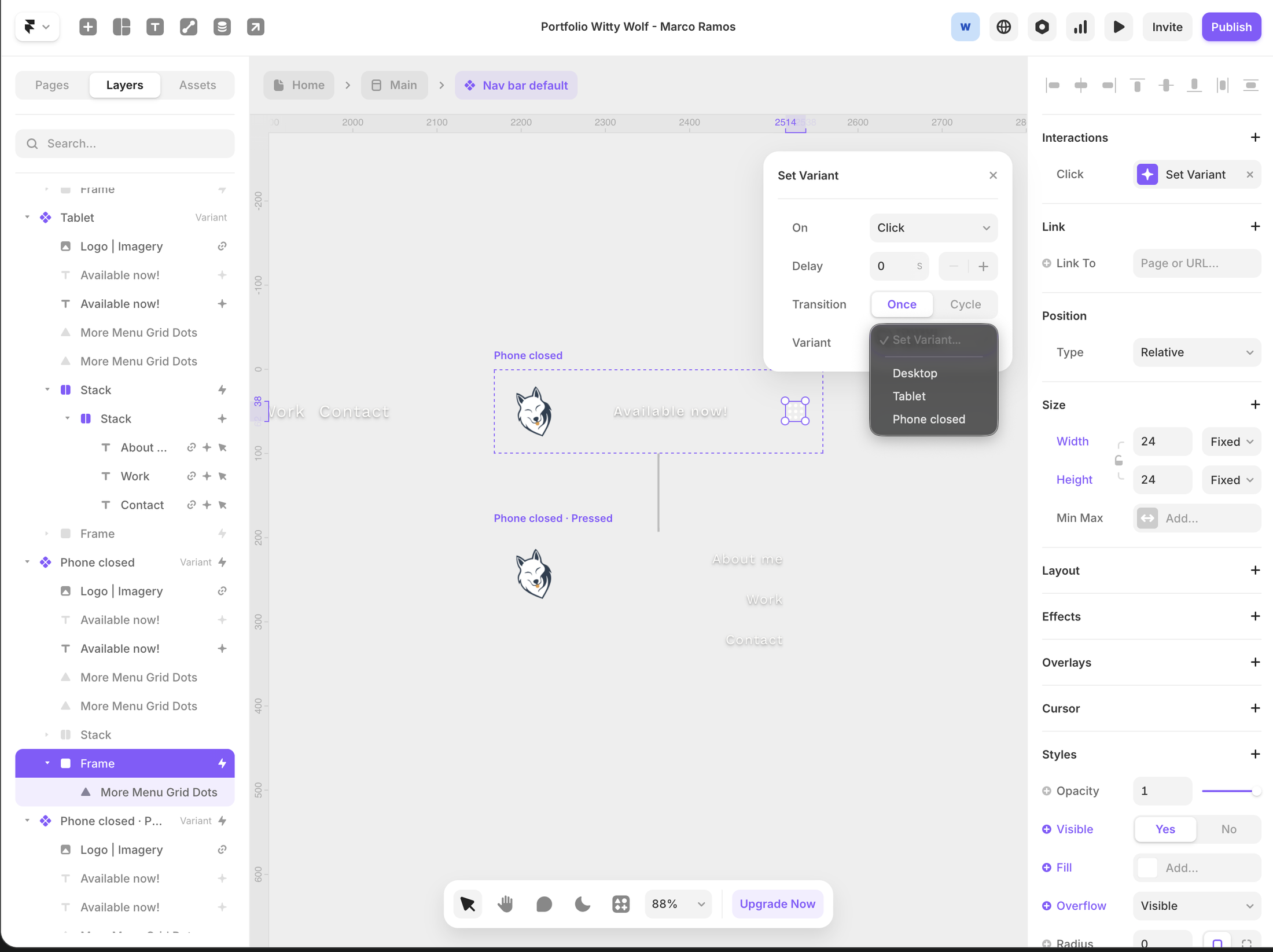
The old portfolio lived in a Framer template. It did the job the way a rented flat does: everything works, nothing is yours. The copy had soul. The vessel had a subscription.
The vessel problem
Someone else’s vessel
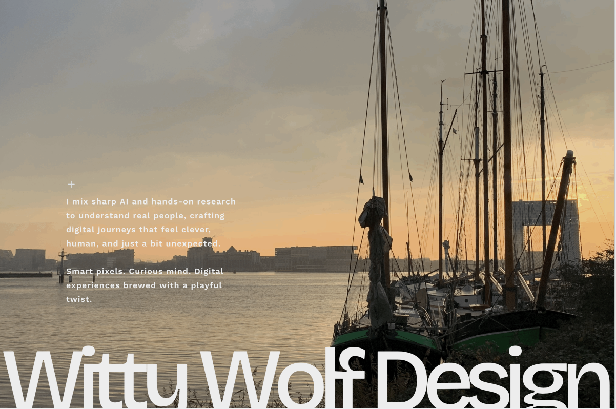
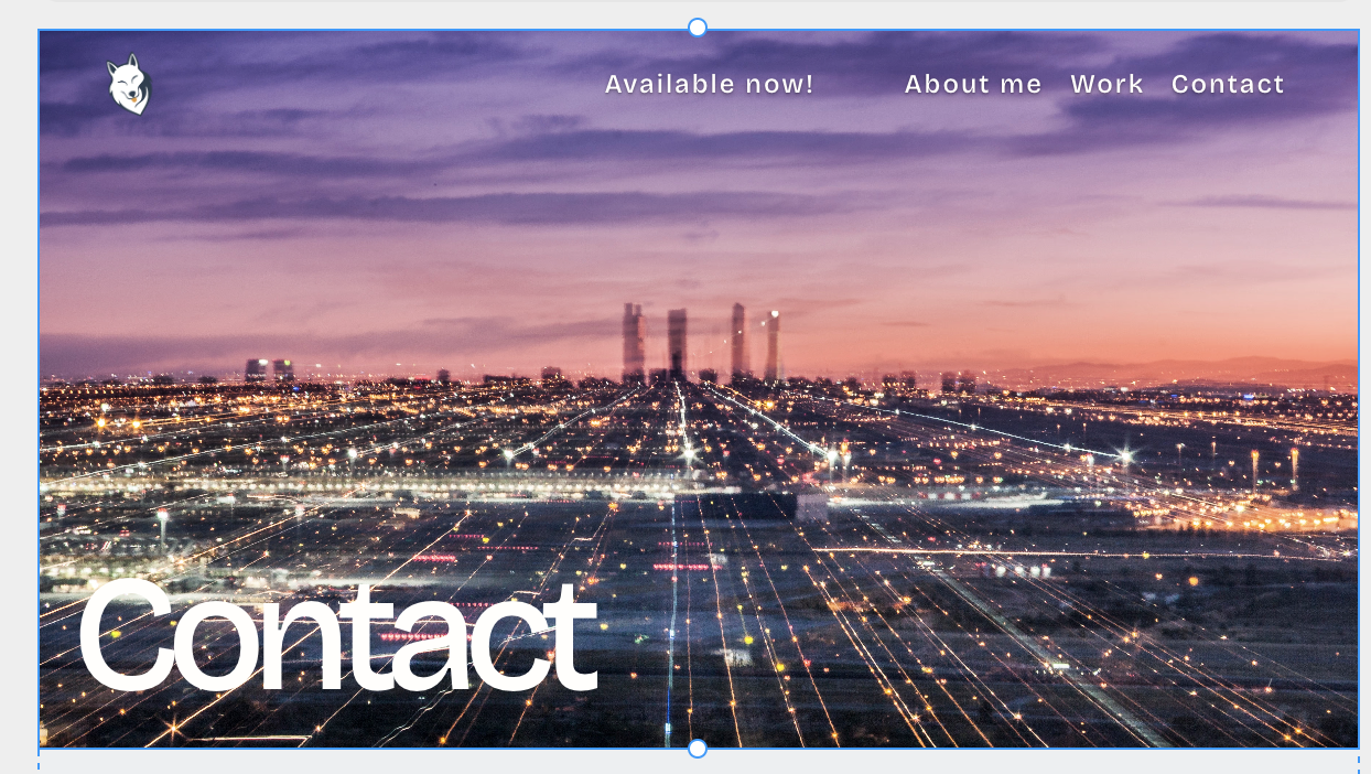
The template spoke first, and it spoke in stock. The hero was a sunset in Amsterdam, the work page opened on a 3D render from a photo library and contact hid behind a city skyline that could sell anything. Underneath sat a wordmark in a rounded display face that has since been retired from the brand entirely.

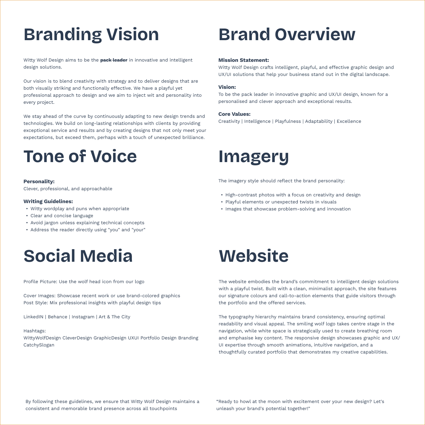
The brand thinking was real and worth keeping: wit as a working principle, plain language, personality in service of clarity. It deserved better than a layout someone else had already sold a thousand times.
The move
Same soul, new vessel
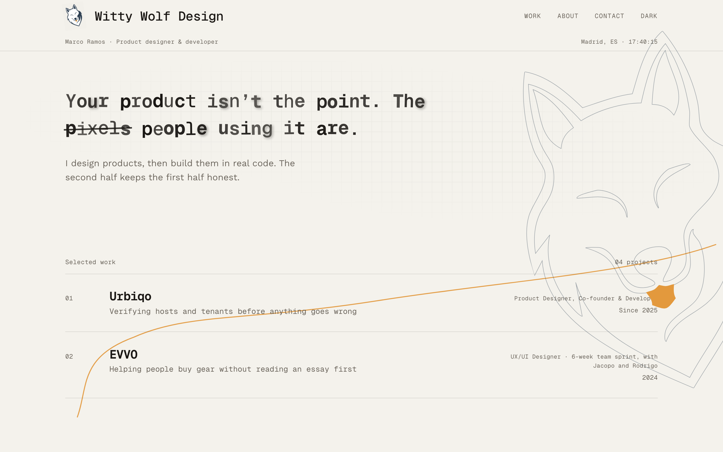
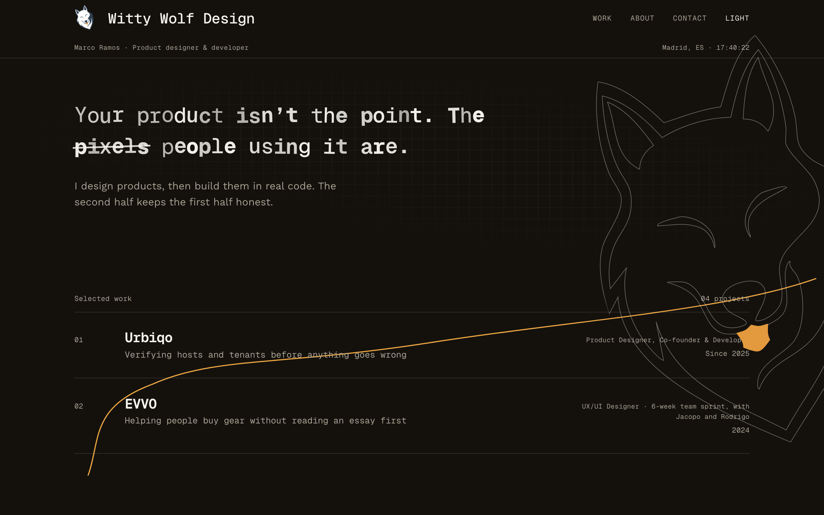
The decision: retire the template and hand-code a static Astro site. Keep the copy’s voice, replace everything it stood on. The art direction became field notes: warm paper, ink, a faint guide grid, thin line work and one amber accent, spent carefully. Two typefaces, both self-hosted: Geist Mono as the voice for headings, navigation, labels and numbers, Work Sans for long-form reading only. The old rounded display face was retired everywhere, including the brand itself.
01 · The craft
Details that earn their keep
The hero types itself, makes a deliberate mistake, strikes it through and carries on: pixels becomes people. The wolf beside it is the real logo drawn as stroke-only line art that sketches itself in, no fills except the amber tongue. An amber scent trail draws down the page as you scroll, a live clock keeps Madrid time in the meta line and the footer answers in terminal. Dark mode arrives without a flash of the wrong theme, honours the system preference, and flipping it earns a beat: the wolf leans in, trembles, flashes an amber eye, then the lamp flickers and the theme lands. Every animation stands down when reduced motion is on.
02 · The system
One source of truth
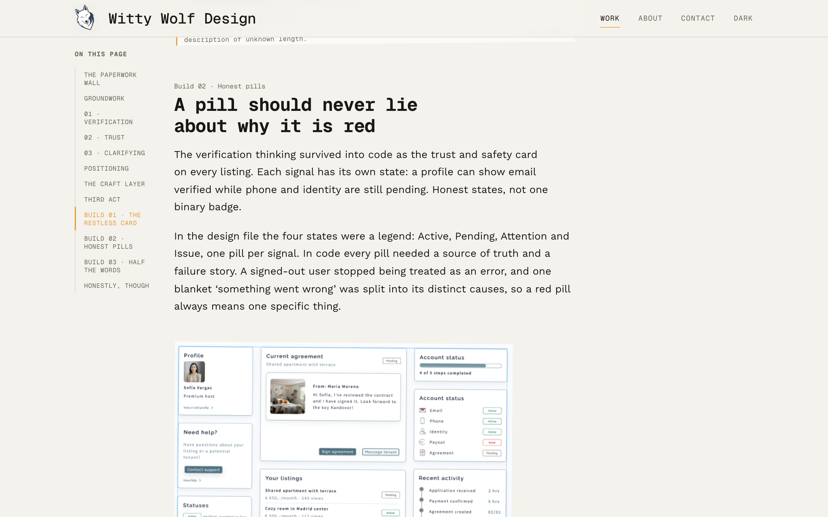
The case pages run on a small system rather than a pile of decisions. The margin labels you see on this very page are the single source of truth for the section index: the scroll-spy rail on desktop, the floating pill on mobile and the anchor links that keep working with JavaScript off, stamped in at build by a tiny rehype plugin. Figures share one field-notes treatment, tape and pins for images only, never for type. Each case opens under a rubber stamp of its client’s own mark, punched in after the title finishes typing.
My worst client
I am my worst client
Shipping for yourself means meeting your own critical self, and mine is the hardest client I have. No brief to hide behind, no one else to blame. A showcase also stops you going wild: the design has to step out of the way of the process, so restraint is the job, not the compromise.
The Framer site took nearly four months. Most of that was not building, it was deciding. What to show, what to cut, which images earned their place, where the balance sat. This rebuild was faster, because the deciding was already done. The work was redaction, cutting what was abundant and what I had quietly started to resent. The hardest part was killing my darlings.
Criticism from a client or an employer is easier to take than from me. I am kind of an asshole when I have to criticise myself. Then it gets polished. And polished is not the same as AI-made.
Honestly, though
The most honest test there is
A portfolio has no conversion numbers worth quoting, so I will not invent any. The outcome is ownership: every line of this site is mine to change, and changes take minutes, not a support thread. Urbiqo taught me that building your own design is the most honest usability test it gets; here the lesson came home, because this time the client was me, and the client notices everything.